
Evolution of cutting wood to make prints.
WOOD ENGRAVING . WOODCUTS . LINOCUTS

This resource is an extension to the online catalogue for the exhibition Stopping Time: Material Prints 3000 BCE to Now which toured NSWs and QLD in Australia 2019- 2021. The venues were; Gympie Region Art Gallery, Newcastle Art Gallery, Logan Art Gallery and Grafton Art Gallery. The online catalogue follows the content of the hard copy, but with some extended material related directly to the works in the exhibition. The tone and depth of this additional resource material on wood engraving does differ from the main online catalogue in that it is specifically designed for tertiary level students, studying visual art. The bias in selecting the material, favouring those training as artists, printmakers and photographers, should be blatantly obvious. This is not said, because it will not interest a general reader, but to explain why it contains so many references to primary data, and any contentious material, or facts that might be disputed, are given citations. With a few exceptions, all URL links are directed to public or educational sites such as British Museum, National Gallery of Australia, the various State Art Galleries, and the Trove database in the National Library of Australia, which is an invaluable resource to access Australian newspapers and journals, although the quality of the digital copy does vary. For international sources the most valuable access point it the internet ARCHIVE. When references to journal articles are given the links are supplied to URLs for accessible copies or abstracts that do not require a log-in to a university or college library. No links are supplied for the citations in the Illustrated London News, the Penny Magazine and a few other illustrated papers that sit in the Gale – Newspaper Data base which needs a subscription. Not a big problem, as most university or college libraries will have a subscription (the cost is beyond the reach of individuals). Also check your local public library as many give you full access to the Gale databases. In Queensland, Australia, Brisbane City Library subscribes, for example.
In a number of cases, where copies of high-quality images or editable text were not available anywhere on the Web, the originals have been scanned to PDF or Hypertext. These internal links are easily identified as the text link is accompanied by a small circular image. The same applies where high-resolution images are given internal links.
The argument and propositions put here are dependent on the many sources I’ve cited, so it should become obvious when I’m speculating from experience.
The material on this site can be used freely for non-commercial educational use. Permission is expressly denied for commercial use of any kind.
Professor Ross Woodrow BA Univ. of Queensland, MPhil & PhD Univ. of Sydney.
The digital version of the print catalogue supported by the Gordon Darling Foundation can be accessed here, on ResearchGate

Before the extended examination of the history of wood engraving, this brief introduction presents a selection of the wood cuts and wood engravings in the Stopping Time exhibition. Most often the origin of the term wood engraving is allocated to a time in the late eighteenth century in Europe when new methods of graving end-grain of boxwood were developed. The techniques and style of this so called “white line” engraving as was pioneered by Thomas Bewick (1753 – 1828) and his followers in Newcastle, England, becoming the dominant early variant of wood engraving. This was to be transformed into two broadly different approaches, one being the familiar densely linear hatching that defined “photographic” tonality and the other a much more fluid open cutting with emphasis on bold outline and selective parallel hatching with minimal cross hatching. This latter style was mostly the preserve of the satirical and comic press such as London Punch, along with all the colonial variants such as Sydney, Melbourne, Adelaide, Queensland and Tasmanian Punch. Because the concern was creating facsimiles of caricatural drawings for the images in examples such as Harper’s Weekly or Sydney Punch, the cutting was bold and direct leaving minimal background cutting as would usually be required in wood engraved naturalistic scenes or portraits. These illustrations are often referred to in the journals as “the cuts” meaning cuts as distinct from wood engraving or “engravings” as the London Illustrated News and other serious illustrated papers would refer to their reproductions. Not without irony, this linked the satirical engravings to both the hack jobbing printer’s crude cuts of the chapbook tradition and back to the woodcuts of Durer, Holbein and other traditional exponents of the craft. This is clarified with the selection of examples below from the Stopping Time exhibition. This selection spans about 400 years of western images printed using wood and demonstrates the versatility of a wooden matrix for printing banal or beautiful images of great symbolic, political or descriptive importance. The Durer woodcut is actually the earliest and was produced a few years before the anonymous St Stephen cut and the Madonna by Hans Baldung Grien, who was Durer’s favorite apprentice, was produced only a few years after the Durer example here, indicating an enormous leap in quality in a very short time. The gap between the Bewick engraving and the Australian First Nation portrait is close to a century.


![W. A. Hirschmann engraver (working in Aust. 1880s) after John William Lindt ( 1845-I926) An Aboriginal Woman [Mary Ann Cowan of Ulmarra] Wood engraving , 1886 image 132 x 107mm (original photo 1873/4)](https://images.squarespace-cdn.com/content/v1/5d0a492836336000012bc86d/1630132629883-BJGNXD87FJ5FCKLQGG3D/Lindt-MaryAnnCowansmall.jpg)

The singular and revealing history of Wood engraving as a craft and art
The Stopping Time exhibition was based on the premise that material prints have a particular anachronic or timeless aspect derived from the way such images carry material evidence of their making. This is not to say, necessarily, that material images are superior to digital or screen images, but to demonstrate that they operate differently in the way they carry meaning and to highlight the complex entwining of medium and message in the aesthetic appreciation of material prints. The return to wood as the primary matrix for printed images at the beginning of the industrial revolution in Britain in the middle of the eighteenth century is an example of the unpredictable or even arbitrary forces that link image making and technology since it seems the singular aims of speed or profitability determine the economics of mass production when it comes to making images for publication. Above all, a critical analysis of the rise and fall of the popularity of wood engraving offers further insight into the relationship between material properties of images and the response to, and understanding of, their content.
In both Oriental and occidental cultures the first printed images made for distribution on paper or cloth were printed from wood blocks and most histories of print describe this as the most “primitive” form of printing since by the beginning of the British industrial revolution in the middle of the eighteenth century wood cutting had for several centuries been replaced by copper engraving and etching as the primary form of reproductive image making across Europe and the rest of the western world. Of the western artists of great reputation that followed Durer only Rubens briefly experimented with wood cuts for reproducing his paintings [see this example in the Met] and artists such as Rembrandt and Goya not only endorsed engraving as the primary medium for reproduction of their paintings but mastered the medium of etching, or etching and aquatint in the case of Goya, as independent mediums in their own right. In his lifetime Rembrandt was known as much for his etchings as his paintings. Such was the dominance of etching, mezzotint , copper and steel-plate engraving and lithography, that no western painter or sculptor working from mid seventeenth century to the middle of the nineteenth century would have considered using the mediums of wood cutting or wood engraving to make reproductions of their work. However for a brief period of only several decades from about 1840 until the acceptance of photographic half-tone processes in the 1880s, wood engraving was widely adopted for reproductive prints of works of art and almost exclusively for topical illustrations of human events, triumphs and tragedies. This is the period in Europe and the United States when the popular illustrated press blossomed and monthly and weekly illustrated papers gave artists access to a global audience to distribute reproductions of their paintings and sculptures. For example, a steel-plate engraving of a Landseer painting would take about a year to complete, which wasn’t a problem when the prints were being sold for framing across the colonial world, but when, in the 1840s, the Art Union Monthly Journal wanted to feature the latest work from the Royal Academy in their issues the steel or copper engraving was hardly an option. The Illustrated London News (1842 - 2003) had pioneered the one-week turnaround for multi-block wood-engravings for large scale illustrations and large editions in the hundred of thousands. Printers quickly developed stereotyping or replicating processes, for making a mould of the image plates from plaster, gutta percha or other substances for massively extending the edition size for a plate and by the 1870s electrotyping became a standard way of establishing a molded printing matrix from an image, or image and letter press, thus escaping any limiting restriction on edition size being tied to the life of the plate or block. Nevertheless a steel or copper engraving still took months to complete, even with the aid of mechanical graving tools, and was therefore outside of any consideration for a topical or current reproductive image in the illustrated press.
Highlighting this reappearance of wood-engraving is not to say that wood cuts ceased to be published after the wood-block golden age of Durer. The opposite was the case, for while prints of paintings, image folios and deluxe books were being illustrated with copper engraving and etching, illustrated broadsides, ballads and similar popular publications such as chapbooks* were churned out in thousands by metropolitan and provincial printing presses across Europe and the United States. Since Guttenberg’s revolution wood blocks were the preferred image to insert with the movable typeset for inking up together on the printing bed with a sheep-leather inkball or similar applicator. The wood cut became, if you like, the image of the print trade while intaglio and lithographic prints became the reproductive image of high art, culture and science. Publishers and printers, often one and the same, knew what the public wanted in the broadside text or ballad; horror, monsters, death and damnation, salacious tales and with the addition of an image or two sales were guaranteed. It was assumed, that if a carpenter was to buy a chapbook, their expectations for image quality was lower than the buyer of one of the deluxe Lavater volumes (exhibited in Stopping Time) and this was perhaps a reasonable assumption considering the Lavater cost the equivalent of one full year of their salary. A small illustration on wood could be cut in days rather than the months or more demanded for a large copper engraving. Needless to say, most publishers/printers of popular broadsides or pamphlets didn’t see the need to add to their costs in illustrating the story of Lady Godiva or Robin Hood by employing a professional artist or indeed specialist engraver, given that by the seventeenth century, copper engraving was a highly respected and remunerated profession where the best practitioners would work with the most eminent artists of the day. Consequently if a compositor or printer in the print shop was acquainted at all with drawing or perhaps wood cutting that was qualification enough, given the endearing naivety of the results. [These three images below when originally printed were each around 8 cm wide and although they obviously are now digital versions, all were scanned from facsimiles not the original woodblock prints. Only the Robin Hood title decoration, which shows Robin Hood, Little John, and company, is scanned from a wood-engraving that was itself a facsimile of the original wood cut. ]
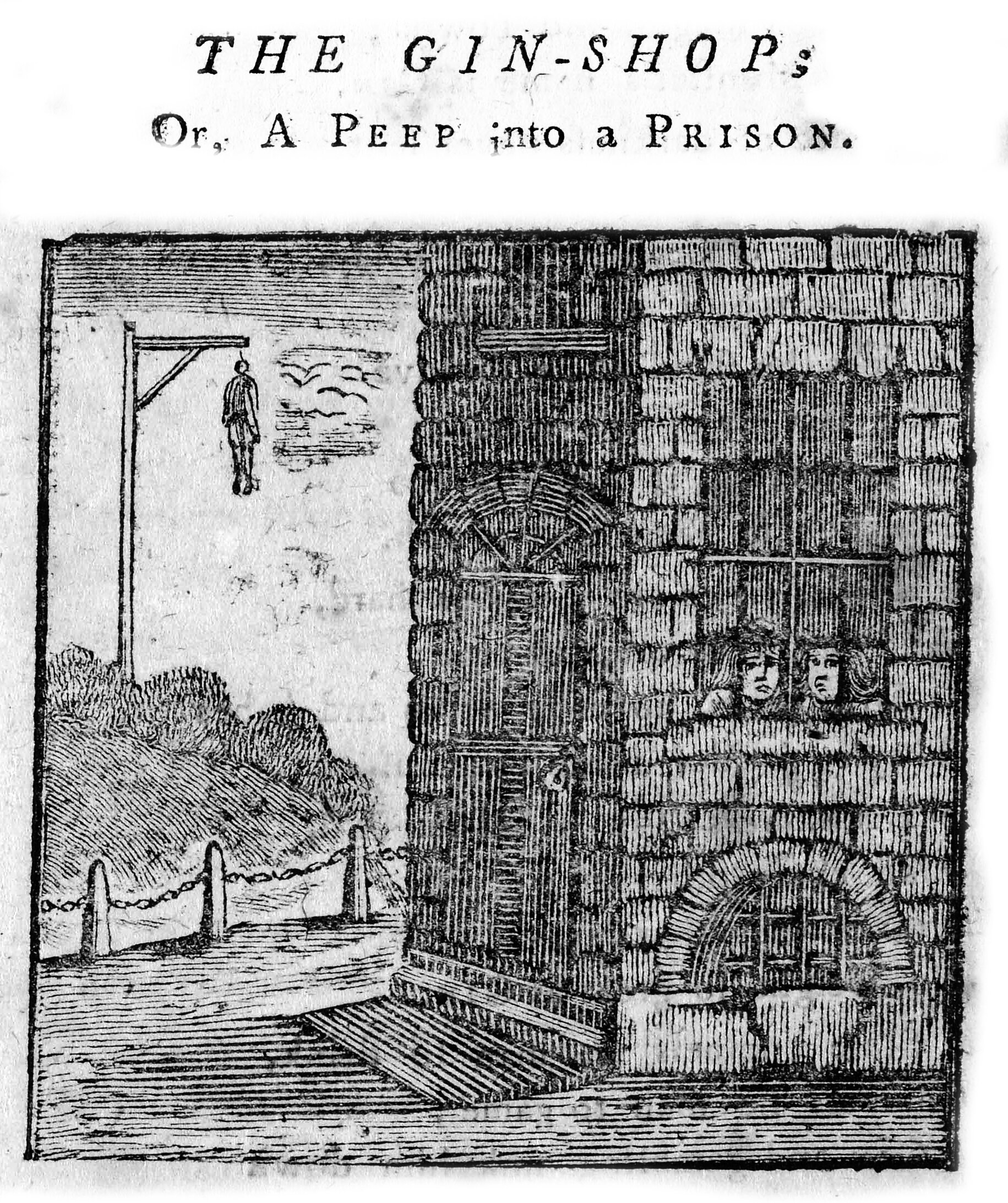
* For more on chapbooks see the McGill Library collection of books and essays. Over half of their 900 book collection has been digitized and available through Archive (link below in the Gin Shop image) but is best accessed through the McGill Library Collection website which is searchable by themes and titles - all available via creative commons copyright free usage. Archive also gives access to 700 or so chapbooks from the Thomas Fisher Chapbook Collection.
Woodblocks cut along the plank or grain of the timber remained the printers preference not simply because they were the cheapest and quickest option, for images, but also because of the easy integration of image and text in the printing process. One of the important aspects of Guttenberg’s contribution to development of the printing press was his invention of a very durable metal alloy for forming the moveable type pieces. Lines of type could be set to print with woodcuts or metal cuts without great difficulty on a hand press. In the second half of the eighteenth century with the development of the steam-powered printing press, that would automate paper feeding and leverage of the platen plate, the weekly throughput of a hand press could be achieved in an hour. The friendless wood-cut became the prime candidate for such relief image blocks and all that was needed was a hard timber that would withstand the same persistent pressure as the metal type. Fortuitously it was discovered that iron-hard boxwood was a perfect candidate for cutting images or more correctly graving images since boxwood was worked on the end grain with gravers that had been progressively adopted and adapted for the purpose during the eighteenth century from metal engraving.
In the first issue of the Illustrated London News May 14 1842 (cover) the editors, in declaring their intention of “launching the giant vessel of illustration into the channel of the broadest and widest that it has ever dared to stem,” noted it was made possible by the revolution in steam power and wood engraving or as they put it, this revolution had “converted blocks into wisdom, and given wings and spirit to ponderous and senseless wood.” Art—as now fostered, and redundant in the peculiar and facile department of wood engraving—has, in fact, become the bride of literature ; genius has taken her as its handmaid ; and popularity has crowned her with laurels that only seem to grow the greener the longer they are worn.” The relatively humble wood-engraved illustrations in the first few issues are a long way for Bewick’s decorative small scaled creations but still only a hint of what was to come in terms of scale and content. The first woodcut on the front page that presented reportage of great fire in Hamburg was a total invention of the wood engraver using an engraving of the city as a base source. It would take several weeks to get sketches from the event and indeed Daguerreotype photographs both of which would form the basis for source reportage of foreign events for engravers. It would be issue 7 of the Illustrated London News June 25, 1842 p. 105 before two wood engravings were published as sourced from a number of “beautiful drawings” by “our correspondent at Hamburg”. On the hundred year anniversary of photography the Illustrated London News (Jan. 21, 1939 p. 110) published a Daguerreotype by F. Stelzner of the Ruins of the Alster Quarter of Hamburg After the Fire in 1842 noting it was the first photograph “taken” of a news event and perhaps implying that Daguerreotypes may have been the sources used in 1842. At the very least its odd to suggest the F. Stelzner image is the first news photograph “taken” unless it was published, something that was only technically possible in 1846. At least, the Art-Union Journal reported in Jan 1846 (p.18) the discovery that casts can be “made from daguerreotype plates, a mould having been obtained from the plate in the usual manner, impressions are obtained from the mould by the electro process.”

First wood engraving in the Illustrated London News May 14 1842 (cover) “View of the Conflagration of the City of Hamburgh”
The Illustrated London News investment in a large illustrated weekly was hardly a risky proposition as Charles Knight’s, Penny Magazine first published a decade before, although smaller in format, had been an unqualified success and certainly elevated the status of wood engraving and pioneered stereotyping of the wood-blocks to create print runs of 160,000. The wood engravings in the first issues of the Illustrated London News were not spectacularly superior in quality to the best work in the Penny Magazine during the previous decade. This ability to stereotype or polytype woodblocks to create multiples had an added benefit since the polytype casts could be sent with the letterpress to all parts of the world; allowing the Penny Magazine to be issued simultaneously in London, Scotland, America, Germany, and France. (Art-Union Journal 25 March 1839 p. 25) And, like the Illustrated London News, the Penny Magazine also began with a strong focus on its educational potential for the public, particularly in the arts and natural history and indeed often featured full page reproductions of paintings, sculpture or architecture along with exotic natural history images.
In Charles Knight’s editorial summary of the first year of publication of the Penny Magazine he mentions that the “Wood-cuts” in the first issues were few in number and these “cuts” were mostly recycled from other publications . However the large circulation (200,000) encouraged the paper to “engage artists of eminence, both as draughtsmen and wood-engravers, to gratify a proper curiosity, and cultivate an increasing taste, by giving representations of the finest Works of Art, of Monuments of Antiquity, and of subjects of Natural History, in a style that had been previously considered to belong only to expensive books. [ Penny Magazine Vol 1 March to December 1832 “Preface” Dec. 1832 pp iii, iv] For analysis of the impact of wood engraving on high art publishing and popular culture see: Amy M. Von Lintel ‘Wood Engravings, the "Marvellous Spread of Illustrated Publications," and the History of Art’ Modernism/modernity Volume 19, Number 3, September 2012 pp. 515-542. DOI: https://doi.org/10.1353/mod.2012.0062
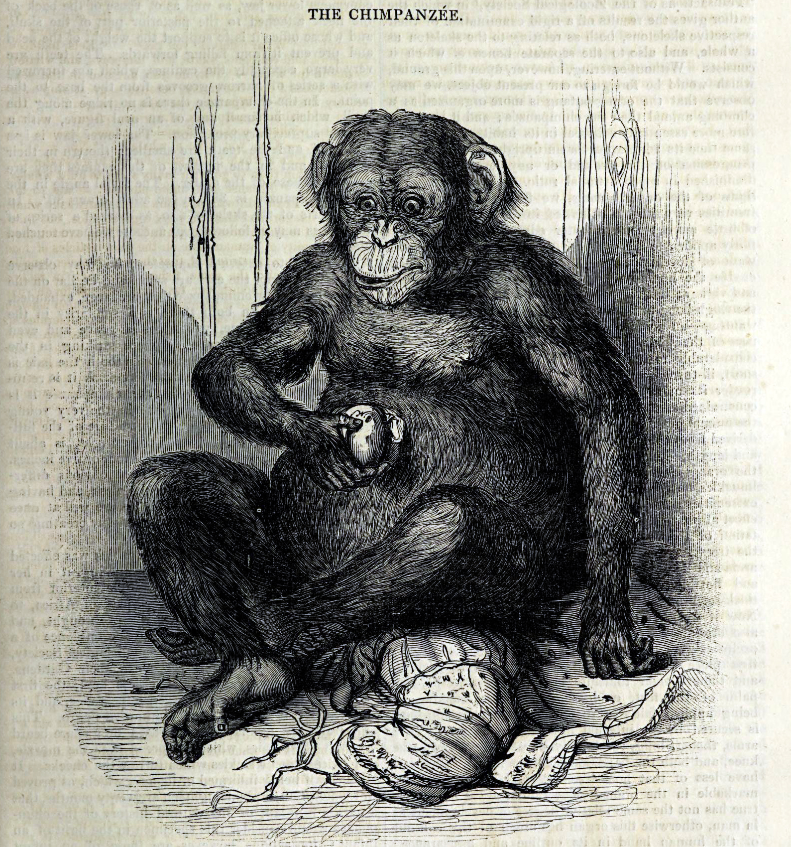
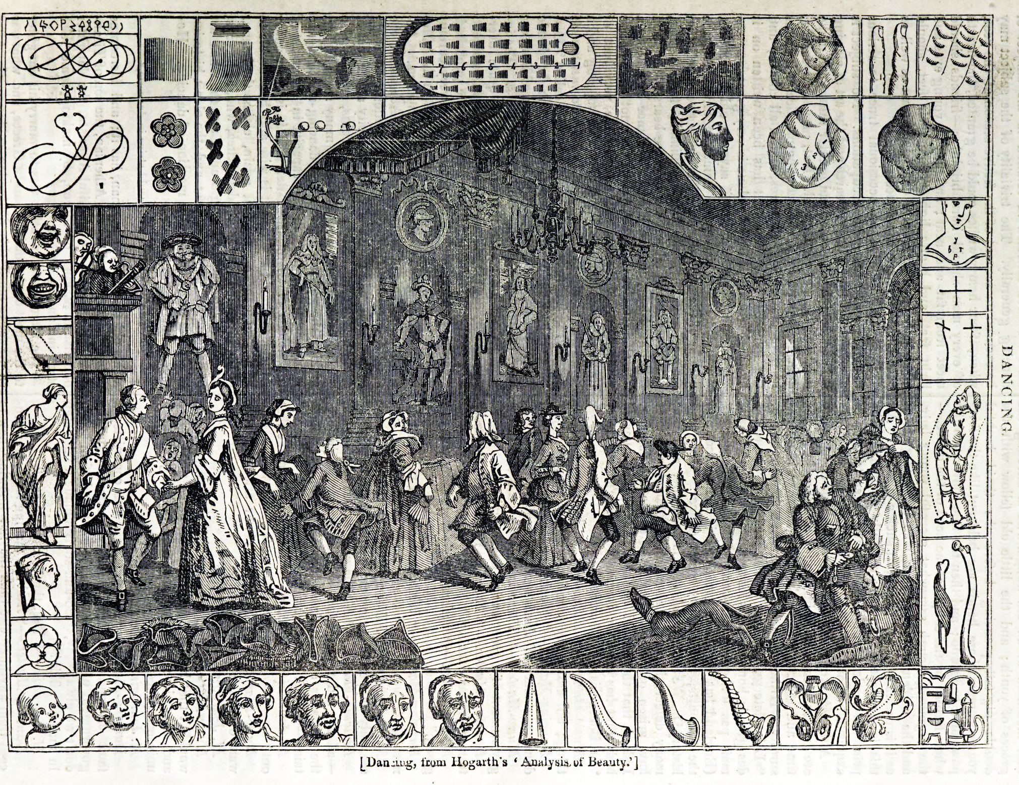
The Bewick school of cutting had been constrained by the standard block size of c. 10 x 15cm, also there was the old problem with creating designs with black border fames enclosing areas of white as such borders had a tendency to break away. The white gaps in the border frames are a familiar feature of early wood cuts and wood engraved book illustrations. The increase in pressure applied to the block by steam-powered presses only increased the risk of breakdown but lack of control of the inking process created bigger issues. Great needed to be taken when inking up a block to ensure that delicate fine lines were not obliterated by over-inking and with machine presses the blanket around the roller pushed the paper deep into the block escalating the problem of over-inking, filling fine divisions between lines and blurring out detail. Bewick and his school solved these problems, even when still inking up with a ball rather than a roller by creating slight variation in the contour of the surface of the block. When the subject was a central motif, Bewick’s animals and birds for example, the engravers “lowered” the edges by a slight shaving of the block to a convex shape before engraving was started. This ensured that the background would take less pressure and less ink than the main motif, and rather than a black border, an irregular gradation around the edge of the block also assisted to visually merge the image into the background. Engravers also mostly increased the bite of the lines as they moved towards the edges, narrowing the width of black lines in other words, which increased the gradation of the lightening towards the edges, presenting strong tapered fine lines for the ink. The worries about breakdown of lines from the pressure of the press disappeared from the mid-nineteenth century when almost all wood blocks were electrotyped or cast in type metal alloy for printing. (Incidentally, the metal cast taken from a wood-block was termed by French printers as a cliché which is the origin of its current usage in English. 1861 ed. p.637.) However when the wood-block design was converted to type metal the issue of ink distribution was equally important, if a design was to have a range of tones determined by the amount of ink and pressure applied. In particular, deep blacks still needed to be type high and light areas to varying degrees below this to take less ink. [For the progress in casting and electrotyping between the first and second editions of Chatto and Jackson go to the 1861 ed. p.636 ff. ] From the late decades of the eighteenth century the millions of wood engraved portraits, colophons end pieces or vignettes in printed publications follow this soft border blending of image and paper, to the degree that the term “vignette” which, originally meant a short piece of writing, before taking on the meaning of a small illustration became the more specific designation of “a small image with fading irregular border”, a meaning it still retains in English and French languages. After the development of larger composite blocks and the stereotyping of blocks for printing in the roller presses, as with all the Penny Magazine examples below, the edges were no longer a critical issue for wood engravings. Nevertheless, this technique of vignetting, that was born of necessity, persisted as an aesthetic device, as with the chimpanzee image in 1836 and remains today as a standard ploy in all photographic and digital image production. Clicking through these Penny Magazine examples gives images of the wood engravings large enough to to see the detail of the cutting. It is also interesting to compare the wood-engraved Hogarth plate with the original plate II, etching/engraving, by Hogarth in his Analysis of Beauty of 1753 (held in the British Museum). Apart from the amplified coarseness, especially note the way the engraver has removed the cross hatching from all the wall and floor surfaces of the main image and how the fine intaglio lines of the original line drawings have been beyond the scope of the relief process of wood engraving, so they have more than doubled in thickness for strength. The typeset showing through the paper in places on some of this images is because all image pages in the magazine were backed with type.
In the time-span of a single generation, wood engraving went from being regarded as the last rude or rudimentary option for printing images in a publication to the first or only possible choice for mass publication, not to mention significant profits and national or even global reputation for the illustrators. For the first eighty years of the nineteenth century wood engraving remained the most popular print form for images in newspapers, magazines, handbills and illustrated books in Britain, Australia and other British colonies as well as the United States. It is important to note that increasingly after the 1850s with the advent of massive roller presses printing both sides of the paper simultaneously, in most cases, the woodblocks themselves were not used in the print run but simply to make a mould to create an electrotype, or stereotype from thin copper or zinc that would be mounted around the printing roller to take the ink.
In the English-speaking world during the nineteenth century the “bible” of wood engraving technique was Jackson and Chatto’s A treatise on wood engraving, historical and practical, first published in 1839, with a second edition published in 1861 and a third in 1881.
With more than six hundred pages, upwards of three hundred illustrations for the first edition and over four hundred for the second, all wood engravings, this was an impressive volume. The principal authors were William Andrew Chatto, (1799-1864), a writer and John Jackson (1801-1848) a wood engraver. Chatto did all the research and most of the writing but John Jackson who cut all the illustrations with the help of his workshop had the upper hand in the publication to the extent that the first edition only lists John Jackson Illustrator on the title page. This in itself shows the power shift that had occurred in status of wood engravers in the 1830s that Jackson could dictate such terms. Incidentally, Jackson sometimes engraved for the Penny Magazine and Chatto becomes the go to author to write about wood engraving for the Illustrated London News over the years, co-publishing his selections of the best examples and even doing a free supplement on the history of wood engraving in the issue of April 20 1844. Needless to say the second edition lists William Andrew Chatto as the author and John Jackson as the illustrator. No doubt the passages on practical wood engraving technique and the obsession with the abuses of the steam press is the voice of Jackson. In between the first and second edition of the Treatise on Wood Engraving, Chatto in 1848 published an extensive history of the printing and use of playing cards which became a standard text on the subject and was well illustrated with wood engravings. All these illustrated texts and editions can be accessed free on Archive. The links are:
The John Jackson (and W. A. Chatto) first edition of A Treatise on Wood Engraving, Historical and Practical 1839 (Getty Research Institute) 738 pages with full index.
The William Andrew Chatto, second edition of 1861 with a new chapter on the artists of the present day by Henry G. Bohn and 145 additional wood engravings. (There is also a Chatto and Windus version of this second edition)
And the third edition of 1881 published in New York and London at 664 pages is little changed from the second edition and does not update the artists or technology discussed.
William Andrew Chatto’s Facts and speculations on the origin and history of playing cards 1848 [is from the University of Illinois ubana-champaign collection]
The massive, heavily illustrated treatise by Chatto and Jackson served to establish the European lineage of wood-block printing traditions, highlighting its increasing sophistication and refinement in the hands of cutters working for Durer and others in the late fifteenth century through to the wood-engraving techniques developed during the industrial revolution in Britain in the eighteenth century. The great antiquity of wood-block printing in China is mentioned only briefly (pp 28 – 33) as a potential point of origin of the craft, but not pursued. This British publication, of what was essentially a manual for the thousands of wood-engravers employed in newspaper and publishing printshops across the globe in the nineteenth century, not unexpectedly, gave much credit to the English engraver, Thomas Bewick (1753 – 1828), for the “invention” of the new wood engraving techniques. As with the evolution of all printing processes, wood engraving was the product of collective contributions of at least several generations of countless anonymous printers and artists. Bewick and his circle in Newcastle-on-Tyne undoubtedly made significant impact on the style and techniques adopted in the first phase of commercial wood engraving in the early years of the nineteenth century but boxwood and graving tools were used by other engravers before Bewick.
It was more than implied by Chatto and Jackson that Bewick had discovered the essence or language of the wood-engraving medium with his focus on creating surfaces not with grids or nets of lines by imitating etching and engraving, as was so often the case, but by adapting the various gravers to create surface marks to best represent the texture of the visual element being depiction by relieving white in a field of black in a wide variety of ways. Structure and atmosphere were given priority over linear contour with a greater emphasis on simultaneous contrast of black and white or texture against white ground. A lump of foliage could be quickly defined for example by light cuts in the surface of the block for the leaves with no further definition needed. If parallel lines were to be used to create tonal variation Bewick and his circle in Newcastle favoured the pure white line that the graver leaves when drawn across wood, although with much more subtlety than the way the previous eighteenth-century trade cutters had done when cutting their own designs with what was dismissively described as white line engraving. For skilled engravers using wood to the middle of the eighteenth century in England, France and Germany at least, was to imitate the defining black-line created by copper engraving. The three images below are from Chatto and Jackson and were intended to demonstrate the superiority of Bewick’s technique by showing it next to the standard practice of a wood engraving imitating a metal engraving, along with the source of the copy.

The first is an engraving of the Fox and the Goat from Aesop’s Fables on copper by Le Clerc from around 1731, the next a wood-engraved reversed copy by Edward Kirkall in mid century and the final version by Thomas Bewick from 1818.
The comparison might succeed in showing the superiority of the wood-engraved image to represent the greatest variety of tone and texture but it does not necessarily show that this is the exclusive essence of the wood engraving technique. After all, by the time this claim was being made, there were other print processes; aquatint, mezzotint and lithography, that could also produce the widest range of tonal and textural variation. The three-way comparison does give viewers today a more significant insight into the nature of how wood engraving was interpreted in the first quarter of the nineteenth century. So complete was the intertwining of subject and medium that the syntax of the wood engraving technique dissolved into unconscious irrelevance and invisibility, just as the surface of the screen does today when viewing these images. All three are wood engravings which is acknowledged in the preface “From” to each caption used as twentieth-century viewers would refer to a photograph “taken from” a painting. As happens so often in the Treatise, this is Jackson the wood engraver acting in the role of accurate translator of visual data, the facsimile maker, and by implying an indexical role for wood engraving, simply proving that the perceptual and aesthetic boundaries for cutting boxwood were impossible to define in the hands of highly skilled engravers. Here it only proves the enormous versatility of wood engraving: since this was, first, wood engraving becoming copper engraving; second, wood engraving becoming a copy of metal engraving technique (didn’t we just see that?); and third, wood engraving making a perfect copy of a Bewick wood engraving. Needless to say, to the viewer today they are simply three examples of wood engraving when of course they are actually three digital prints representing wood engravings, as only in the Chatto and Jackson volume do they serve their intended purpose.
Over the decades following both the first and second editions of Chatto and Jackson’s Treatise, their assessment that Bewick’s technique represented the true or distinctive expression of the medium was generally accepted. Many bemoaned the “modern” approach of open cutting used to imitate free flowing lines as was demanded in the new monthly satirical journals such as London Punch (published 1841 - 1992) where the wood engravers had to create a facsimile of the cartoonist’s pen sketch as opposed to those working on the Illustrated London News where images were valued as accurate reportage. London Punch was motivated by, if not modelled on, the French illustrated magazine, Le Charivari that was published in Paris from 1832 to 1937 and significantly used lithography not wood engraving for its large illustrations. This medium allowed the artists to drawn directly on the stone for printing. An example from Le Charivari by Daumier is included in the Stopping Time exhibition.
In the 1880s the long-term productive partnership between photography and wood engraving was turning into one of enmity born of rivalry, although the fatal potential for the wood engravers craft wasn’t fully clear as yet. The increasing sophistication and quality of halftone printing processes forced new attitudes to quality engraving in the book-publishing as well top-end illustrated press. America was overtaking Britain as both the leader in printing technology and wood engraving. In 1880 there were 2,400 registered non-newspaper magazines in the United States and 5,500 by the end of the century. (Frank L. Mott, A History of American Magazines, vol. 1 (Cambridge, MA: Harvard Univ. Press, 1939. 342). The degree of the differential between Britain and America in approaches to quality wood engraving can be assessed by the following comparison. Go to The history of wood-engraving in America by William James Linton (1812-1897) published in 1882 and compare the illustrations with those in the Chatto and Jackson third edition of 1881 to see that American wood engravers were doing work at a scale and variety that made the majority of the engravings in the Chatto and Jackson Treatise look sadly anachronistic. After Linton had established his own wood-engraving firm in London, he moved to the United States in 1867 and became a great advocate for what he saw as the “New School” of engraving in America mostly based around the engravers working for Harper’s and Scribner’s monthlies. He remained a supporter of Bewick’s aesthetic but considered it had become debased in England, where engravers did not understand that for Bewick white line was only used when the lines had meaning. He noted that the English developed “a style whose users, forgetting that the graver is a tool with which to draw , lose all their vigor as artists, content with effects to be obtained by smooth and delicate tones and multiplication of weak because meaningless lines.” (p.34) He promoted the precept that the engravers key role is to interpret the subject and surfaces being depicted above any slavish replication of the artists drawing, painting or photograph. Formulistic shading techniques (he has constant critique of cross hatching) and repeated mannerisms were to be avoided and sweeping defining lines were to wrap the surface in a manner that matched the material being defined and the character of the image. The early American engravers integration of photographic processes into engraving such as the transfer of photographs onto blocks is tolerated with no objection by Linton. To get a understanding of how he judged quality in an engraving, go to the comparison Linton makes between two portraits on pages 68 and 69. Firstly, note that William M. Chase portrait by Kruell on page 68 is being comparted with The Professor by Juengling which was meant to be bound in the book opposite but unfortunately in the Archive copy (and other online copies) it has been mis-bound after page 71. It is noted in the captions that the wood engraving by Kruell is from a photograph and the engraving by Juengling is from a painting. This difference in source matters little to Linton who judges the Kruell (one of his favorite engravers of his designated New School) the superior on the basis that he creates a vitality to the image by adapting each of his engraved lines to the demands of the particular element he is engraving. As he put it on page 69: “The Kruell head is smaller, and the work is minute; but the lines are pleasant, and in accordance with the forms they represent, helping the representation, which Mr. Juengling's lines do not. One would think that he has no sense of fitness of line, no perception whatever of lineal beauty, or that some eccentricity makes him averse to any lines that are sweet and graceful. The one head is the work of an artist; the other, perhaps more clever, only shows a remarkably skillful mechanic. Throughout the one work there is a feeling of beauty and fitness, of which I cannot find a trace in the other. “

comparison of wood engravings in Linton `1882.
For much of the nineteenth century in Europe and the United States and to a lesser extent Australia, art students with fine motor skills, who showed talent for drawing and copying, knew that the wood engravers craft was a steady, secure, although not spectacularly paid, occupation if a career painting portraits or other pictures didn’t pan out. A career as press artist or cartoonist generated a more solid income and although there were exceptions, such as Sam Calvert in Australia, who could engrave their own designs, there was a clear division between artist and engraver as distinct occupations, with the divide created by the opposing binaries of invention and replication.

The collaboration between artist and wood-engraver varied across publications and practices but the illustration from the Illustrated Sydney News of 24 Nov. 1870 p. 85, shown here, demonstrates the typical setup for large, illustrated papers with artists and engravers working in close proximity. The engravers are along the window bench and Monte Scott and a fellow artist are working on the table at back centre in the premises in George Street, in Sydney Australia. The first of these three images of wood engravers at work is a self-portrait of Samuel Calvert (1828–1913) at work in 1855 at Melbourne Punch (Vol 1 p.161) where he mostly cut designs for Nicholas Chevalier (1828-1902). The 1870 image also indicates the beginnings of dramatic change or the demise of the centrality of the craft. To begin with, two lithographic stones, one of a building and other an illustration of Mr Punch from Sydney Punch, which was printed in this Gibbs and Shalland premises, indicates the importance of lithography to the print trade but more significantly, the way the heavy stones are unusually tilted on end to be set up for a photographic shot, makes explicit the photographic source for this image, which has been replicated by the wood-engravers it depicts. By this time in the 1870s engravers were often working from photographs as opposed to artist’s drawings. By this time in London the technical means were available to translate the photograph to an etched plate without the intervention of an artist or engraver, although this was much less an option in the colonial context. Indeed, reading the explication of wood engraving technique that accompanied the illustration of the artists’ and engravers’ room at the Illustrated Sydney News in 1870 it might appear that little had changed in the century since Bewick’s first word engraving was created using graver on boxwood end-grain. The description closely follows that in Chatto and Jackson’s A Treatise on Wood Engraving, 1861 pp. 568 -569.
The only wood with sufficient toughness and closeness of grain for fine engraving is boxwood. Of this it is difficult to procure pieces more than five inches square; for larger pictures the block is composed of several pieces accurately fitted together, and fastened with bolts and screws. A full-page picture in the Illustrated Sydney News will be composed of twelve separate pieces. The upper surface of the block is polished, and upon it the artist, ‘with a fine lead pencil, makes a drawing precisely as though he were making one upon paper, only the reverse way, giving every line just as he wishes it to appear. This block is given to the engraver, who cuts away every part of the wood not covered by the artist’s lines, which are thus left standing in relief. It must not be supposed, however, that the skill of the wood engraver is limited to the mere mechanical task of following the exact lines traced by the artist. In many parts of a drawing the artist does not actually draw all the lines. Thus he paints in a sky in India ink, giving the general form of the cloud and the gradations of tone and color, the engraver translating this into lines of different forms and thickness, the difference in tone being given by making the lines finer or coarser, or nearer or farther apart. Wood engraving is an expensive operation, each of the half-page blocks in the News costs for drawing and engraving from 8pounds to 10pounds, and each issue contains about eight or these blocks, or an equivalent to other shapes and sizes, besides the usual lithograph. It will be thus seen that the illustrations alone form a no small item of expense.

Paul Martin (1864 - 1944) c. Engravers at work c. 1880s courtesy V&A
The next image is a wood engraving from about 1890 depicting the engraving room at the illustrated magazine Black and White in London and suggests there was still plenty of work for wood engravers at that time. However, any astute engraver understood that their days were numbered for press work. This is because by 1890 not only were most of the images they engraved sourced from photographs but various technical processes to transfer the photograph directly onto a zinc or copper plate had been perfected to a very high level of resolution and subtlety, demanding the question, why pay an engraver? Importantly, looking at this image published in 1893, the hand-levered platen presses in the background were only there in the engravers room for printing proofs of their engravings as their blocks would not be used in the final printing of the Black and White journal but instead would be locked in with the typeset for each page layout and this letterpress block would be used to create a duplicate electrotype plate for printing.
This photograph which shows the wood engravers working at the Magazine of Art in London probably dates from around 1885 as it is by Paul Martin (1864–1944) who had been apprenticed as a wood engraver from 1880-1883 and had dabbled in photography since his early years, becoming a serious hobby in 1884 before finally opening his professional photography studio in 1899. The source image that one of the engravers is working from is shown and appears to be an ambrotype photograph. The Magazine of Art, even after it has fully moved to process engraving directly from photographs remained a champion of the aesthetic qualities if not superiority of the finely rendered wood-engraved image.

It becomes clear when looking at the history of the impact of technology on image reproduction that image quality is not necessarily what determines which process will be adopted. Instead, the key selective factors are cost and practicality for mass-production. Nowhere is that better illustrated than with the reproduction of early photography. Up until about 1860s, apart from using lithography or wood engraving to make copies of photographs for book illustration the only options were tipping in the original photochemical photograph or more commonly to use the “ink” versions produced by “the two most beautiful photomechanical processes of the nineteenth century - the carbon print and the woodburytype print”. * These processes in fact made better prints than the original photographs they reproduced, because they didn’t fade or deteriorate, however these processes would not allow text to be printed along side the image on a sheet so they became redundant. The process that replaced them in the late 1870s, photolithography with its variations of collotypes, heliotypes and albertypes, were inferior in image quality and also didn’t allow image/type letterpress combinations but images could be printed cleanly to any margin on the same sheet of paper that would be bound into the book. All of these processes produced continuous-tone as in the original photograph as did the photogravure process that used a random grained copper plate to create tone in the manner of intaglio printing with aquatint. However the gravure technique of graining the plate quickly evolved into the now familiar half-tone process where a dot or crossline screen would break up the surface of the plate to take ink for all types of printing; relief, intaglio, relief or planographic. This process would inevitably break the continuous tone of an original photograph and to varying degrees reduce its clarity, and is certainly no better than the other ink processes, but because it could easily be married with the new linotype technology it would become the dominant form of photomechanical reproduction. The linotype machine was invented in 1896 and this allowed for the mechanisation of typesetting by forming a full line of type from molten lead and the process of half-tone also allowed for printing the illusion of a range of tonal values from black to white. An image made up of dots and type-set when reduced lead are no different in a printing press. After all dots of lead in a half-tone are no different to full-stops in text only smaller.
* Alex Sweetman Photographic Book to Photobookwork: 140 Years of Photography in Publication (California Museum of Photography Bulletin: Volume 5, Number 2, Jan. 1986 p. 7) Along with the quotation this paragraph borrows heavily from this same publication.
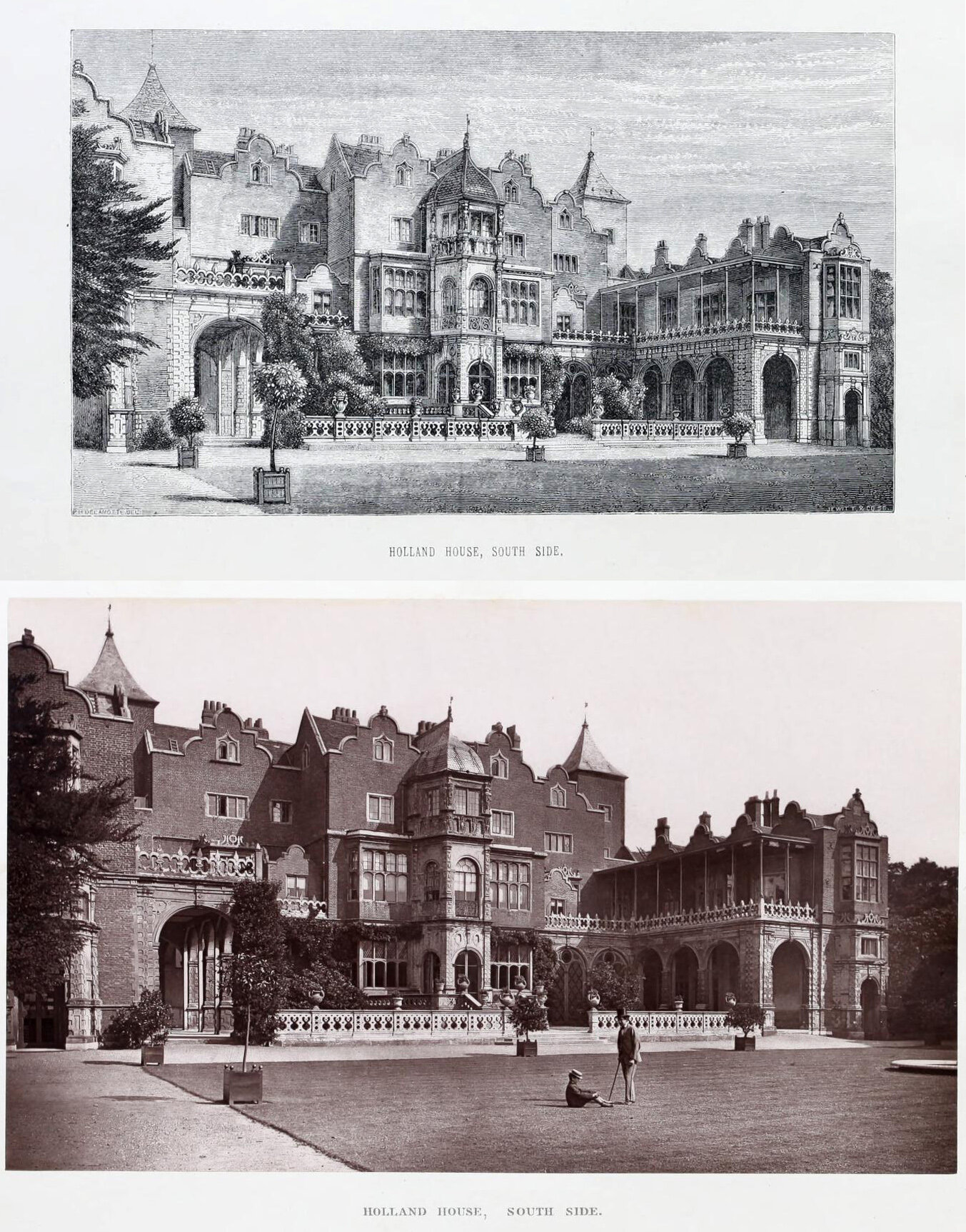
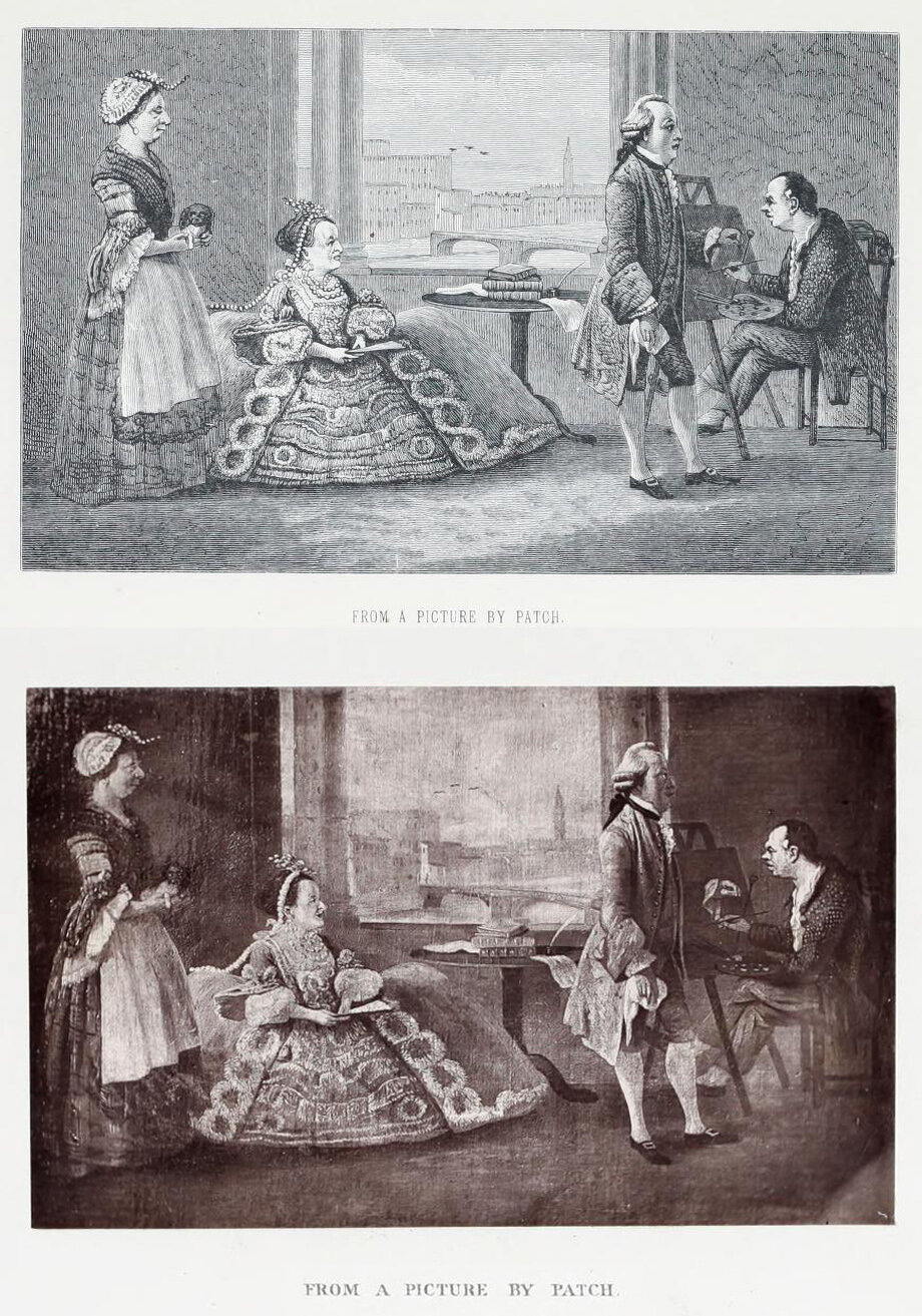
The book Holland House by Princess Marie Liechtenstein (1843-1931) was first published in 1874 with about sixty or so illustrations and decorative pieces. The majority of these were wood engravings with a few steel plate engravings and a lithograph. Soon after, in the same year, a second deluxe edition was published which for anyone interested in the relationship between wood engraving and early photography is of great interest, because along with the other prints, it includes 37 of woodburytypes after photographs that are the basis for many of the wood engravings. The original photographs are attributed to Philip Delamotte (1821 - 1889), the wood engravings are by James Davis Cooper (1823-1904), the steel engravings by Charles Henry Jeens (1827-1879). Publisher: Macmillan & Co. The comparative examples below don’t appear together in the publication as here but are bound on different sheets sometimes several pages apart which makes this publication all the more interesting to contemplate. It seems obvious that by not replacing the wood engravings with the woodburytypes, which undoubtedly give a more accurate continuous tonal reality despite some lack of descriptive detail in the shadows it was assumed extra or different information was conveyed by the wood engravings, that couldn’t be captured in the phototype print. However, whatever the motivation it certainly included acceptance of a factuality of the woodburyprint since it was tonally the mirror of the photograph from which it was printed but the third edition published in 1875 did not include the woodburytype prints. All editions are available on Archive including the one of interest the second edition of Holland House by Princess Marie Liechtenstein (1843-1931)
From the 1840s photography and wood engraving were partner processes in the printing trade and it is doubtful that wood engraving would have progressed much beyond the achievements of Bewick and his circle without the developments in photography. As early as 1858 The Art Journal would publish that photographic transfer onto wood was common with engravers in Germany along with the progress of various methods in England See Art Journal Nov. 1858 pp 335, 36. In 1859 the Illustrated London News quotes from the Photographic News in outlining the transfer process for photo-transfer to wood blocks describing the process as Xylophotography (ILN Jan 8, 1859 p. 38) Certainly the exponential rise in the quantity, scale and quality of wood engraving in the nineteenth century parallels the developments in the use of photographs as the defining factual image. The point here is that photography was not responsible for the demise of wood engraving in the nineteenth century but for its rise to prominence and the collapse in demand in the last decade of the nineteenth century was simply because of its enormous cost in production time. When the linotype revolution came in the 1890s a stereotyped transfer of a wood engraving was the same cost as using a photograph but the cost differential between taking a photograph and making a wood engraving was enormous. From 1890 some expensive journals and magazines persisted with the inclusion of wood engravings, as shown in the example of Black and White magazine discussed below, but the die was cast. In the United States in 1890 the average wood engravings in some illustrated journals was 90%. By 1895 it was 37% and by 1900 just 18%. In the same period the use of half-tone reproduction goes in the other direction from 9%, to 63% to 80% at the end of the century. [These stats from: Edward W. Earle Halftone Effects: A Cultural Study of Photographs in Reproduction, 1895-1905 CMP Bulletin: Volume 8, Number 1 p. 4]
Wood engraved photograph Illustrated Sydney News 24 Aug. 1861 (cover image).
The first published wood engraving to use photographic transfer onto a block in the Illustrated London News was in 24 Aug. 1861 (front page). Shown here in digital form. The acknowledgement of a source photograph along with name of the photographer or photographic company had begun the year before in relation to portrait engravings. The half tone process was available in England from 1882 but the Illustrated London News resisted abandoning wood engraving and it was not until the mid-1890s that half tone photo plates and illustration begin to dominate the paper.
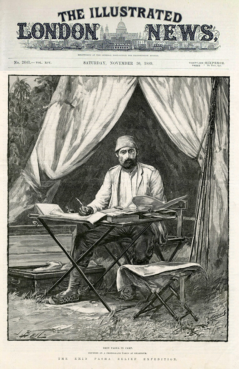
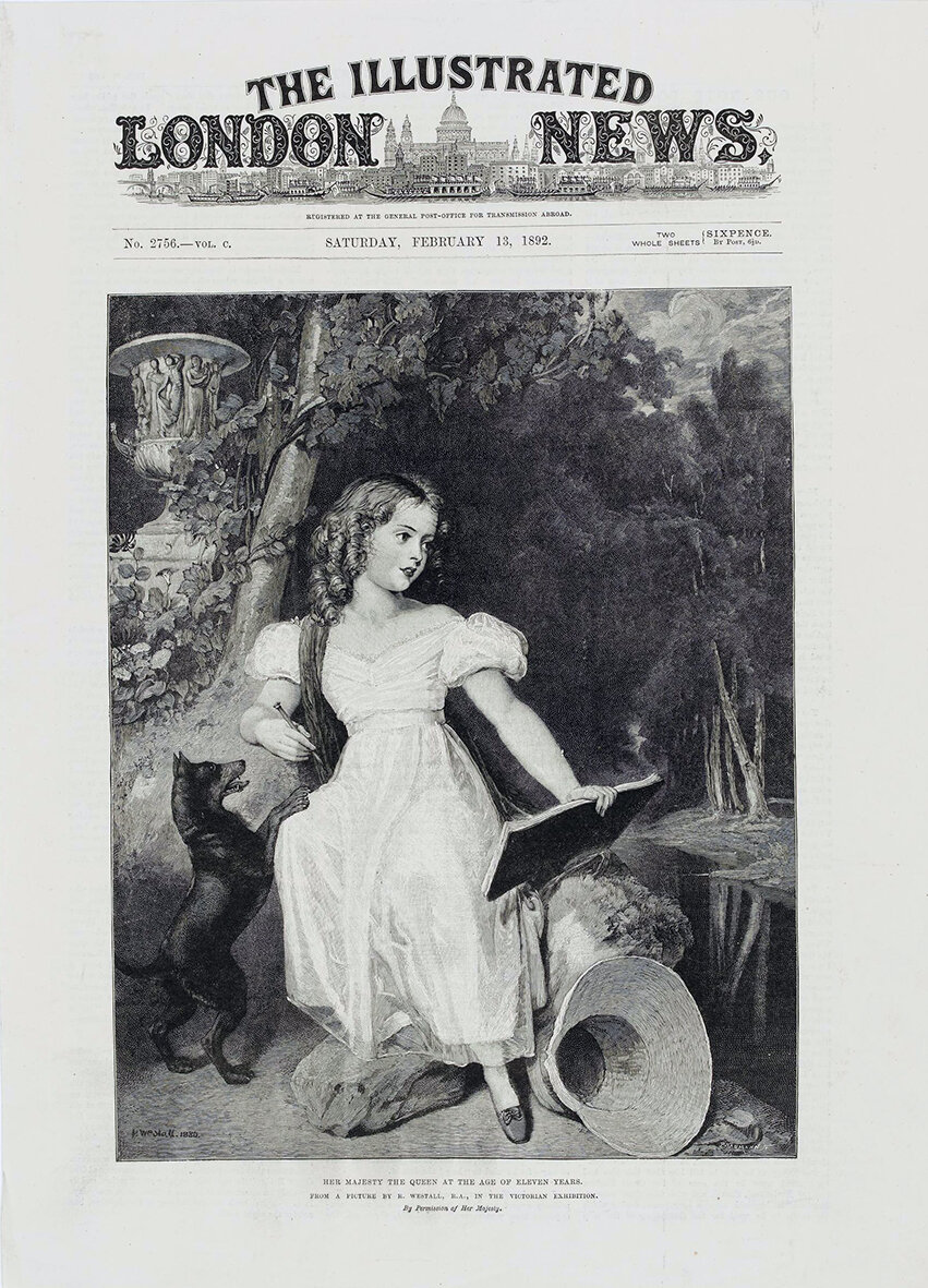
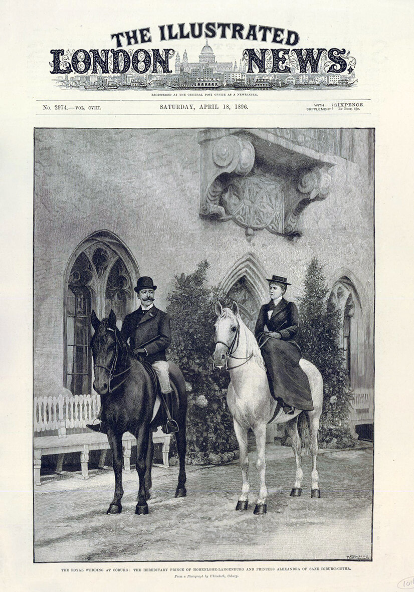
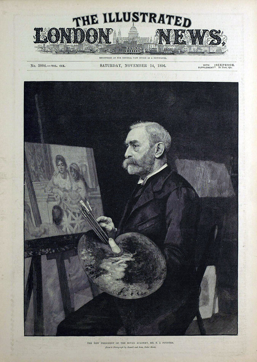
As can be shown with the examples below, a highly skilled wood engraver, such as Paul Naumann (1851 – 1887 fl), could still command the cover with a wood engraving into the middle of the 1890s regardless if the subject was topical reportage, a fine art painting, or photographic portrait. These four examples by default show the increasing importance of photographic processes. In the first example Naumann is engraving a photograph which has been converted to an illustration by another artist. The second is a portrait from a much earlier painting, no doubt viewed in photographic reproduction. The third image is directly from a photograph, as acknowledged, and the final example from a photograph of a painting as noted in the caption.
All these images are linked to high resolution versions in the British Museum and will allow close scrutiny of the engraved surfaces of the images. All but the final image are available for high resolution download for non-commercial use via the copyright waiver of creative commons. Each will open in a new window which needs to be closed to return to this site.
The London based Dalziel Company had built one of the largest global wood engraving business in the early 1860s and for more than twenty years influenced British if not global illustrated publishing. The engravings they published by countless different engravers were usually simply signed “Dalziel”. In the boom years of the 1850s to the early 70s there was greater publishing demand than there were engravers to meet it and scores of apprentices were taken on for apprenticeships that were usually five years long, but could run to seven. The entire archive of the production of the Dalziel family from the years 1839 to 1893: around 54,000 fine burnished proofs, are kept in chronologically order in 49 albums in the British Museum. The archive is accessible but can be difficult to negotiate as it seems the only sure way to gain access is by searching each album in turn using their accession number - which takes you to the index page for that volume and below this, for scrolling, is a series of thumbnail images of each page. Not fun, see the screen shot. At least the University of Sussex has put up a listing of the accession numbers for each of the 49 volumes with the year or years they cover.
For more on use of this Dalziel archive, or the Dalziel Project, see: Bethan Stevens (2019) Wood engraving as ghostwriting: the Dalziel Brothers, losing one's name, and other hazards of the trade, Textual Practice, 33:4, 645-677, DOI: 10.1080/0950236X.2017.1365756
For a comprehensive (but unillustrated) overview of the trade with details on apprenticeships, income and so on, along with excellent notes on primary and secondary sources see: Michèle Martin “Nineteenth Century Wood Engravers at Work: Mass Production of Illustrated Periodicals (1840–1880)” Journal of Historical Sociology Vol. 27 No. 1 March 2014 (132-150) DOI: 10.1111/johs.12005
Solid overview of the decline and mention of reasons for its revival in the late nineteenth-century/early twentieth. Jan Conway “Nineteenth Century Wood Engraving: its commercial decline” Art Libraries Journal , Volume 41 , Issue 4 , October 2016 , pp. 224 - 234. Published online by Cambridge University Press: 20 September 2016 DOI: https://doi.org/10.1017/alj.2016.23

Sample volume with link to just this volume 1880 in the BM Dalziel archive.
The general economic downturn in the early 1890s in Britain and its colonies was matched by the dramatic decline in the wood engraving trade. Dalziel Brothers went bankrupt in 1893 and London Punch sacked all its engravers in 1894. Large newspapers and magazine that regularly employed 20 or more wood engravers, by the end of the century would have six or less, mostly working part-time. However, there remained a demand for specialist wood engraving for quality monthly magazines and facsimile cutters for technical and scientific publications. Taking a snap-shot selection of published images from Britain and the United States from 1893 gives an insight into the astonishing variety of printing techniques that were on offer, the range of colour, metallic and other options that were available and the exceptional resolution of the photography and tonal range of the wood engraving. What makes this oversight possible is the publication of The British Printer (1888-2000) which was a journal started by The Printers’ International Specimen Exchange to showcase of the best available work from around the world. The entire volume from 1893 has been made available online with very-high resolution images of each page using the University of Amsterdam’s Metabotnik. All the images shown below and of the printing of the Black and White magazine come from this 1893 volume. However, they are scanned from the original paper volume, fortuitously as it turns out, since four pages from the article are missing in the digital version.
This British Printer article is the clearest, concise description of the operation involved in printing an illustrated paper in the last decades of the nineteenth century and essential reading for anyone interested in printing or publishing. A PDF of the entire article can be downloaded here.


The two images above are exactly contemporary, from 1893, and about the same scale in the original (10.4 x 21.5 cm) and (11.5 x 16.4 cm) respectively. What they dramatically demonstrate is the coexistence of wood engraving and photography, often in the same publication, for the last decades of the nineteenth century. The printing press was the new arrival from Germany for printing the London magazine Black and White, a journal that itself printed both wood engravings and photographs, along with half-tone photographic images of paintings and wash drawings - a selection from a 1895 edition is presented later. The printing-press illustration was presented in the British Printer as part of an article/interview with W. R. Orford the printer, and the working of the printshop producing a “high-class illustrated journal” (p.401), titled The Printer of “Black and White” Printing as Art, Not a Mechanical Operation. The train is a specimen advertisement from The British Printer to advertise Swan’s new halftone electrotyping process. The reason wood engraving is preferred over a photographic representation of the printing press is that so-called facsimile engraving, that is the exact copying of the lines a drawing or design was always the primary and trusted method for representing engineering, scientific or technical drawings - after all the result was often an exact copy of the drafted plan that created the object. Besides, once the block was cut it was transferrable to multiple scenarios such as advertisements which no doubt is what this block was originally cut for. [if you look through the 1893 online copy of the The British Printer you will see almost all the printing press advertisements are wood engravings] Cutting parallel lines and curves was the wood engravers stock in trade and such repetitious fill could also be done with an engraving machine. This parallel white line style for adding descriptive toning had also of course been used since the 1860s and 70s when photographs (including of machines) were transferred directly onto the blocks for cutting. The major reason for such a choice in 1893 was not purely nostalgia for this established engineering aesthetic but because this style of wood engraving was highly descriptive, in fact often serving the same purpose as a drawn plan making it far superior to a photograph in conveying specialist technical knowledge. This explains why this technical form of facsimile wood engraving survived well into the twentieth century as the examples from 1930 demonstrate. These are in fact from Clare Leighton’s manual on Wood engraving from 1932.
In keeping with the character of his “high-class” journal, Orford also chose wood engravings for all the illustrations such as the “Engraving Room” was shown above and below are two wood engravings of the presses in operation, presumably including the new one shown above. Wood engraving was also the preferred choice for such inventive descriptive scenes of workshops and machinery operation, even though they were obviously sourced from a photograph as a basis for editorial erasure and additions.


The British Printer article on the printing of Black and White Magazine gives a full description of the electrotyping of the wood-engravings for printing. The much earlier illustration of the steam engine above was also prepared to be electrotyped so it was not necessary for the engraver to cut any of the rest of the block since only the machine would be printed from the copper or zinc plate that was made. Once a block was cut it could make any number of electrotype plates. This following full-page advertisement from the 1893 British Printer gives some indication of the speed and quality of the processes available for electrotyping by the 1890s. If you click the image larger the fine vertical white line just right of centre is usually a sure indicator of two joined blocks starting to separate as they are also with the steam engine block above it. Very difficult to be looking at digital version of fine wood engravings but if you think you can work out the comparison you can go to the original engraving in Warne’s Royal Natural History through Archive.
Unfortunately, this single page supplement to the 1893 British Printer is not bound into the online copy scanned for Metabotnik so best to download this one if you want to make comparisons. It is scanned at 300dpi.
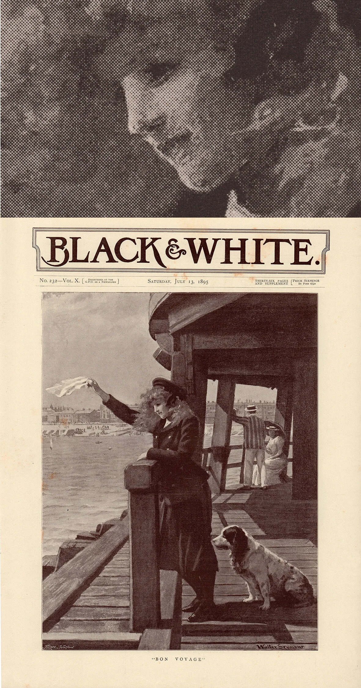
The following examples serve to show how to identify the character of wood engraving in comparison to the other processes such as metal-plate engraving and half-tone photographic reproduction. The selection from the Black and White Journal July 13, 1895 demonstrates the very heterogenous character of the different reproductive processes for images, often operating simultaneously in the same publication during the 1890s in British and Americal illustrated publications. Acknowledging of course that the electrotyping of each prepared letterpress block would bring all the surfaces together for inking, although each processed image block would carry the characteristics of its production, be it dot-screen or wood engraving or relief cut.
Half-tone photographic print after a painting, original sheet c.38.5 x 29 cm. Detail above to reveal dot-screen originally scanned at 2400 dpi.

Series of photographs from Black and White magazine each of the four photographs in the original publication were c. 10.5 x 14 cm. The detail 2500 dpi scan is of the female shooter. Note in the caption the photographer is acknowledged and on the lower corners of each reproduction is the logo of the photo-plate maker.
At this stage in the late nineteenth century the ink reproductions of photographs using dot screens were distinctive enough from the original chemical image to be acknowledged with the description “From a photograph/s” just as wood-engraved reproductions from photographs were often so acknowledged as being sourced “From a photograph.” By the beginning of the twentieth century the ink photograph in a book or newspaper would lose this categorical distinction of a reflection, refraction or second-hand version and become “the photograph” of the subject. Importantly, the “trust” in the photograph was in the process of being constructed but at this stage in the 1890s audiences were very much attuned to accepting wood engravings as the most authentic of visual mediums. People living in Britain its colonies and the United States as elsewhere in the second half of the nineteenth century had via the vehicle of the Illustrated London News, the Graphic, Harpers Weekly and Monthly, the Illustrated Sydney News and many other illustrated papers, viewed the worlds big events, Royal celebrations, wars, heroic and dastardly deeds, not to mention art from antiquity and modern times, through the medium of wood engraving. When the Illustrated London News used full-page wood engravings to represented significant topical events in the 1850s the images was often captioned as “from a sketch by” or “By our special artist” and “from a photograph” was reserved for wood engraved portraits. By the 1870s it virtually went without saying in most illustrated papers that wood engraved images of place or event were dependent on photographic sources. Although the shift in primacy of carrier medium to photography is still underway in the 1890s it is interesting that when dot-screen photographic reproduction was used for drawn or painted illustrations the description “From a drawing” is never used yet the artists signature will often be included prominently in the image, as with the example below, and in some rare cases such as the cover image of this 1895 issue, along with the artist’s signature will be the brand or name of the photo-engraver or processor.

Illustration by W. Dewar for Black and White Magazine July 13 1895 p. 43 original c. 15 x 22 cm. This is a photographic reproduction of a drawing using a fine dot screen to capture the stylish velocity of the showy linear drawing.
All that is needed to explain why half-tone photographic portraits were still battling for a place in illustrated journals, such as the Black and White Magazine from 1895, is a comparison of Lord Provost Bell, one of the few photographs reproduced, with two wood-engraved photographs from ten years before. The portrait of Police-Sergeant Cragg is from the American illustrated magazine the Quiver. The portrait of the Australian First Nation woman, Mary Ann Cowan of Ulmarra is engraved from a photograph taken in 1873 by John William Lindt (1845-1926) and was reproduced in the Picturesque Atlas of Australia in 1886) [These are both scanned from the original wood engravings.] It needs no specialist knowledge to see that the homogenizing effect of the dot screen cannot compete with the variety and sharpness of contrasts available to a highly skilled wood engraver.

![W. A. Hirschmann engraver (working in Aust. 1880s) after John William Lindt ( 1845-I926) An Aboriginal Woman [Mary Ann Cowan of Ulmarra] Wood engraving , image 132mm x 107mm](https://images.squarespace-cdn.com/content/v1/5d0a492836336000012bc86d/1630028636729-2VVW8OD6Y06R6R7L5MT2/Lindt-MaryAnnCowansmall.jpg)

Over several generations, nineteenth-century audiences across the globe had become so attuned to this entanglement of photographic source and wood engraved interpretation that it was impossible to simply strip the photograph away from the association. When wood engravers copied non-reproducible Daguerreotypes the ocular transaction was a familiar one of translation but with photo-transfer to the block the engravers role becomes very different. In a perceptual and conceptual sense the wood engraved block had become the primary matrix in creating the published photograph. The understanding of one medium became determined by the other and vice versa, to the degree that judgement of content and quality was not simply an acquired aesthetic determination but a perceptual verdict based on the skilled investment of the block maker. It is hardly an overstatement to say that skilled engravers could give life to the source photograph and this is probably best illustrated in a case where the aim of the wood engraving is purely an “artistic” one, rather than being a representational portrait, as with this full page wood engraving “The Spring of Life” published in this 1895 issue of Black and White; assuming first, one can overcome any aesthetic resistance to the saccharin sweetness favoured by the Victorians. Ironically, this image may well have been sourced from a photograph but its construction and reason for being is as a virtuoso display of wood engraving since this is what gives the image its vibrancy or vitality which, beyond argument, is far removed from any dot-screen photograph available at that time. It should be noted that such images of female personifications of abstractions such as the seasons, senses, elements, emotions, epochs and continents were a staple over many centuries for painters and engravers. However, such full-page images of “beautiful” females would become an essential element in popular illustrated papers and magazines throughout the publishing world controlled by European and American publishers in the latter quarter of the nineteenth century. For example, in the early 1880s the Graphic in London ran double-page supplements of “Types of Beauty” with wood engravings derived from painting that the Graphic had commissioned especially from artists requested to create representative types of English or French beauty. These are also virtuoso performances of wood engraving that predate this example by more than a decade and certainly worth examining in detail.

Sheet from Black and White is c.38.5 x 29 cm and the detail below was originally scanned at 2,400dpi

The special status of wood engraving this late in the century is more dramatically demonstrated in this issue of Black and White from 1895 by looking at the key advertisement pages. The few full-page advertisements are wood engravings as are all the other advertising images with the exception of one photograph. Clearly, stock wood-blocks for particular companies had a long life and could be easily recycled across publications and time but there are very few of such stock advertisements in this “superior quality” journal. The investment in time in several of the wood engravings is most obvious and aimed to attract the viewer in a very different way to the single photograph as testimonial to a product. It is fair to say at this stage of development of the dot-screen technology a viewer got much more information by close looking and surface scrutiny of a wood engraving than they did from a photograph. This is regardless of if it were an advertisement, reproduction of a painting, portrait or inventive illustration. It is also easy to overlook the distance between the creative invention and adaption of the wood engravers craft and the mechanical application of dot matrix when audiences are now so unfamiliar with the technique.


Sheet from Black and White is c.38.5 x 29 cm and the detail originally scanned at 2,400dpi is here reduced to 300dpi.

Advertisement wrapper for Black and White July 13 1895 column height 31 cm, width 5.2 cm.

Back page of the outer coloured wrapper for the July 13 1895 issue of Black and White Magazine. wood engraving. sheet 39.5 x 28.5 cm
Dot screen photo plate from July 13 1895 issue of Black and White page 64 bottom of page at 12.5 x 22 cm
This contrived tableau used in the singular dot-screen photograph reproduced in Black and White in 1896 is as disconcerting today as it no doubt was then, although today the audience has the familiarizing influence of a cosplay or dress-up selfie or image of “the kids.” Put simply an indexical image of someone else’s baby couldn’t possibly become the generic baby for each parent to project their baby onto. Testimonials generally only worked when the audience knew they were moderated by the genericizing influence of wood engraving just as audiences are well aware in the contemporary context that the synthesizing, testimonial voice or image, is that of an actor.

The above illustrations are from (p425) Illustrated London News in 1844 which ran a continuing series (including a free supplement) on the “History and Practice of Wood Engraving” from April 20 - 6 July. The author, William Henry Chatto, drew from, and expanded upon, the material published in his major Treatise of 1839. All the depictions of wood engravers in the nineteenth century took as a given that the “invisible hands” of the engravers were always male. This wasn’t always the case. To begin with, along with the three Dalziel brothers, the family company also included Margaret Dalziel (1819-1894) who worked, off and on, in the business for her entire life and the regular contracted staff included at least one or two females. The “Emblems of Engraving” below from 1839 is engraved by Mary Ann Williams (b. c. 1788). Henry Cole (1808-1882) in the first extensive discussion of “Modern Wood Engraving” in 1838 had noted the exquisite delicacy and elegance of her engravings. This was in the context of him suggesting the development of a dedicated female engraving school specifically for: “educated gentlewomen of the middle classes, who now earn a subsistence chiefly as governesses, we wished to point out this art as an honourable, elegant, and lucrative employment, easily acquired, and every way becoming their sex and habits.” (The Westminster Review 1835-08: Vol 29 Iss 2 p. 278.) The Art Union took up the issue with qualified support two years later noting: “Unhappily, in England, women have very few means of turning talent to profitable account ; and it is our duty to seize every opportunity we can for their acquiring independence.” (“Wood engraving” Art Union journal 25 Mar. 1838 p. 32). Cole was ultimately successful as a wood engraving class was set up in the Female School of Design in 1842. By 1843 an increasingly competitive market was developing for freelance engravers because of the division of work in the larger wood engraving establishments such as Swains or Dalziels and the expansion of the practice of illustrated papers employing there own engravers. Consequently, as the Art Union journal reported in their October 1843 issue, the wood engravers of London attempted unsuccessfully to close down the scheme and this was seen by the journal as a cause for rejoicing “that ladies who desire to learn the art shall be taught it.” The only objection was to the teacher appointed who as “half-amateur and half-professional was beneath the quality they deserved. (“Wood-engravers” Art-Union 1843-10-01: Vol 5 Iss 58 p.271).

In the first quarter of the twentieth century, in London, which meant the centre of the English speaking art world, women played pioneering roles in the revival of wood engraving as noted by Barbara Ann Taylor. [see Barbara Ann Taylor “Wood Engraving by Women Artists” Oxford Art Journal , Apr., 1980, Vol. 3, No. 1, pp. 79-81) . According to Taylor a key pioneer was Charles Darwin’s granddaughter, Gwendolen “Gwen” Raverat (1885 – 1957) who taught herself wood engraving based on a study of Thomas Bewick’s work in 1909 and went on to develop a highly individualistic style, based on the fragmentation of light as used by the Impressionists who she was connected with through her French partner. She was also a founding member of the Society of Wood Engravers and worked mostly at small scale although Raverat was highly productive in the first decades of the twentieth century. This Neil Philip blog piece has details of the most recent book on her work. However the other key pioneer nominated by Taylor, Clare Leighton (1898 - 1989), was obviously not so sure of Raverat’s status since in her 1932 book on wood engraving, the example of Raverat’s work is used as a failed example of wood engraving as clearly Leighton saw her as a painter. [Wood-Engraving and Woodcuts p.33] Certainly the case for Clare Leighton as a pioneer and champion for wood engraving is beyond dispute. After formal studies at the Brighton College of Art in 1915 and the Slade School of Fine Art, Leighton produced her first wood engravings in 1922 at the London Central School of Arts and Crafts which became a focal point of the Modern wood engraving revival. Leighton moved to America at the time of the second world war and remained there for the rest of her career living in several different cities and for a period teaching at Duke University. It was not just her prolific output of more than 900 wood blocks that made such an impact during the revival in the 1920s and 30s as Leighton also published seven books. The most influential global art magazine in the early twentieth century was the Studio and Studio Publications in the 1930s published what it hoped would be the definitive manuals or “How to Do It” series and no 2 was Wood-Engraving and Woodcuts by Clare Leighton. Her standing and authority is made evident by the fact that of the series of 35 publications only three others have sole female authorship.

Clare Leighton demonstrating the process of wood engraving from her 1932 book Wood-Engraving and Woodcuts London: Studio Publications 1932 (2nd ed 1944) p. 9.

Dalziel, illustration for 'Wood Engraving', in Laura Valentine (ed.), The Home Book of Pleasure and Instruction (London: Frederick Warne, 1867). Dalziel Archive Vol. XXIII (1867), British Museum reg. no. 1913,0415.184,.
As so often in the battle for gender equality, this was a Pyrrhic victory for women to be trained to enter the wood-engraving trade that was inherently structured to exploit skills for minimum financial return and no acknowledgement of agency or authorship. Woman wood engravers trained in art school or through the apprenticeship system were equally likely to sign their work with a company logo. The highly skilled Clemence Housman (1861–1955) exemplifies this as her engravings for the Illustrated London News and the Graphic do not carry her signature. However, since she began her career at that crucial period of decline in engraving for periodicals, working at the Graphic from 1885 to 1895, Housman was forced to shift the direction of her work from reproductive press engraving to “fine art” book illustration. This is the path that many engravers attempted, regardless of gender, but women took lead roles in this twentieth-century revival of wood engraving as an art in England, America and Australia. A selection of Clemence Housman wood engraving such as the two below can be viewed in the V&A collection. For more on the artist see the book chapter : Lorraine Janzen Kooistra “Victorian Women Wood Engravers: The Case of Clemence Housman”


A link to Clare Leighton’s advice on use of Engraving Tools

. A point that needs to be made here is that the revival of wood engraving in the twentieth century did not occur as the century clicked over to 1900 and seismic shifts in schemas of perception or significant paradigm changes almost never occur so conveniently and apart from major natural or human induced catastrophic events, with technological discoveries and shifts in fashion or style, change is always incremental as the old and new coexist for varying degrees of time and influence. And Clare Leighton makes this point that engraving from a photograph still had currency thirty years into the twentieth century with the inclusion of a work from 1928 by Timothy Cole (1852-1931). William Linton had noted in 1882 ”I have placed Mr. Cole at the head of this new school“ of wood engraving in America.
To extend the earlier comparison of details from a wood engraving with detail of a half-tone plate to understand the techniques. This link takes you to a comparison of a detail of the wood engraving Abraham Lincoln by Timothy Cole with a copper-plate engraving.

In the modern era, exhibitions are commonly used as retrospective demarcation points to pivot paradigm shifts in the arts and culture. The 1925 “Art Deco” exhibition in Paris is one of those style markers and the rise of the humble linocut to prominence is most often located in one or both of the Claude Flight curated exhibitions at the Redfern Gallery in London: the 1929 'First Exhibition of British Lino-Cuts'; or, 'British Linocuts' in 1930.
In 1927 Claude Flight also published a book on what he saw as the new, modern, democratic medium of the linocut, specifically the colour lino-print. This book, Lino-Cuts: A Handbook Of Linoleum-Cut Colour Printing London: John Lane 1927, had nowhere near the global reach or authority of Studio Publications behind Clare Leighton’s book on Wood-Engraving and Woodcuts published five years later but Flight’s book did have the huge advantage of having colour illustrations something completely lacking in Leighton’s volume.
In Wood-Engraving and Woodcuts the forty or so European and American artists chosen to represent the varieties of techniques in wood engraving and woodcuts, excluding an example by Paul Gauguin, represent artists of Clare Leighton’s generation and some at the peak of their fame in the 1930s as artists or illustrators. These include: Käthe Kollwitz (1867–1945) with the virtuoso self-portrait shown below; Rockwell Kent (1882–1971) with The End where high-drama is well served by his signature camp utopian style; Gertrude Hermes (1901-1983) who represented Britain at the Venice Biennale in 1939 is represented in the book by Autumn Fruits to illustrate the use of a large variety of tools to achieve different effects. A better example from around the same date is Waterlilies 1930 which, like many of Hermes prints, looks surprisingly contemporary today and explains the renewed interest in her work. Eric Gill who was an influential figure in Britain at that time in the 30s is well represented in Leighton’s book.


The editor of Art in Australia, Sydney Ure Smith, writing on the “Revival of the Woodcut in Australia” in 1923 [Art in Australia Third series, No. 4 May 1923 https://nla.gov.au/tarkine/nla.obj-351477380 ] nominated the two leading practitioners as Lionel Lindsay and Margaret Preston. By then Lionel Lindsay had already published a book of his wood engraving and Ure Smith gave his work fulsome praise but acknowledged its conservatism by noting that Margaret Preston represented the more radical approach. Or as he put it:
The work of Mrs. Margaret Preston is the modern note in Australian woodcut. Like her painting, it expresses her vitality and rebellion. Its conscious crudity makes it a succession of bald statements. Nothing is feeble or faded. It has personality, animation, vigour. The affectation of the primitive is more evident in her woodcuts than in any other branch of her art. Mrs. Preston issues these prints hand-coloured. They have proved attractive and effective wall decorations.
Ure Smith credits Eirene Mort (1879-1977) as being “one of the first to practice the art of the woodcut in Sydney.” Mort had spent three years studying art in London and was a key player in the art community in Sydney and a founding member of the Australian Painter-Etchers' Society. Ure Smith noted in his article that “The Australian Painter-Etchers' Society is about to devote a section, in its annual exhibition, to woodcuts and lithographs, as work of this nature is often crowded out in an exhibition of paintings.” In 1907 Eirene Mort was also involved organizing the large exhibition of “Women’s Work” at the Sydney Showgrounds in 1907 and Mort’s wood cuts grace the cover of the Sydney Mail Exhibition number and the head piece for the illustrated supplement for the show.
Mort’s work from the beginning of the twentieth century is very much in the fluid style of Art Nouveau or perhaps closer to the British Arts and Crafts work promoted by William Morris in the late nineteenth century in Britain. Regardless, there is a much more dramatic shift in the 1920s towards a bold geometry in the work of Preston and Thea Proctor (1879 –1966). This is the so-called modern style (or Art Deco) of the twenties and thirties. Lionel Lindsay was a great fan of the writings of William Morris and his early work can sit within that Arts and Crafts idiom but his style of wood engraving became tighter and more conservative as his work progressed. Sydney Ure Smith published monographic issues on both Margaret Preston (Dec. 1927) and on Lionel Lindsay (Mar. 1928). Both issues contain collections for their respective woodcuts or wood engraving and the covers shown after the examples below have links to the full selections.
It is important to note that in Art in Australia in writing of the revival of the wood matrix, like other publication around the world, the terms wood engraving and woodcut become interchangeable and as lino is increasingly used as a matrix for relief cutting, lino-prints are grouped under the general heading of woodcuts. Of the early twentieth-century Australian printmakers only Lionel Lindsay consistently maintained the traditional technique of wood engraving using burin on boxwood and other hard timber. [I’m not forgetting that a number of Australian printmakers in the late and post-twentieth century have adopted the traditional cross-grain technique with gravers for wood engraving]
Eirene Mort woodcut 1907
Margaret Prestion Basket of Australian Wild Flowers coloured woodcut
Margaret Preston Girl’s Head woodcut
Lionel Lindsay Morning Tea 1924 wood engraving

Click to see a selection of Preston’s wood cuts

Click to browse a collection of Lindsay’s wood engravings
In the Dec 1921 issue of Art in Australia, Lionel Lindsay wrote a short piece titled “Woodcut” and illustrated with two of his own wood engravings. Like everyone else, he had read Chatto and Jackson’s Treatise and the various articles in the illustrated papers in England. Perhaps in typical provincial fashion, he summed up this theory with unequivocal simplicity.
The wood block is capable of yielding two admirable qualities peculiar to itself —a perfect homogeneous black, and the most brilliant whites, incapable of production by any other medium. Not to retain these qualities is to throw away a gift from the gods, and yet this is exactly what the engravers of the nineteenth century did by persistently aping the black line of steel-engraving. If the art is to be truly resurrected —and there are signs abroad of artists reverting again to the “cut"—it will be established only by a true understanding of materials and tools. Already Auguste Lepere —the greatest living French engraver —has abandoned his old technique and turned to a simpler expression. A recent cut from his hand—representing a centaur approaching a pool—shows that he has dropped finesse for the master qualities of white line and the blacks.
It was hardly an insight to say there were signs of a revival in woodcuts. Lindsay also got it wrong in claiming the nineteenth-century wood engravers “persistently” aped the black-line style of steel engraving, because they invariably used classic white line, especially when working from photographs. This was the style fully developed in America as the “New School” as promoted by William Linton. Auguste Lepere (1849 - 1918) in fact was following that style especially the later more open cutting variants. The engraved self-portrait here by Lepere was published in the showcase of the “New School”, Scriber's Magazine in 1895 -{ copy of this wood engraving in the British Museum.] In his own work, Lindsay did go on to leave large open areas of white paper to contrast with the black areas in his wood engravings during the early 1920s but gradually reverted to leaving a black ground.
In 1925 the Illustrated London News {May 2, 1925 p846} under the banner head of “The Renaissance of an Art: The Revival of Wood-Engraving” published a full page with examples of four “Modern French Wood-engravings which the paper described as collectively “futuristic.” They mostly exhibit the style of open white ground contrasting with bold black geometric forms that will become the signature of modern relief prints of the twenties, thirties and beyond and are obviously much closer to the illustrations in Clare Leighton’s book than to those published by Claude Flight.

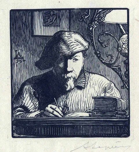

The woodcut revival was obviously also well underway in Australia during the nineteen twenties. Woodcuts or linocuts were being featured on the cover of Art in Australia such as the example from issue no. 21 September 1927 by Isobel Irvine and wood-cuts are regularly used for decorative or historiated initial letters, head-pieces and colophons . Regularly, as with the Lionel Lindsay wood engravings for his “The Woodcut” article illustrations will have noted “a print from the original Woodblock”. This issue of September 1927 published an article on good design which featured the Yellow Glove woodcut by Thea Proctor, for inclusion in her upcoming exhibition in Melbourne that year, and a full page woodcut by Adrian Feint, who was Proctor’s star student, along with a selection of nine lino-cuts by other students in Thea Proctor’s design class at the Sydney Art School [Julian Ashtons]. A colour wood-block print by Margaret Preston also appeared on the cover of the number 11 issue of March 1925 that featured her most controversial article The Indigenous Art of Australia on the appropriation of Aboriginal art to create a national style. All illustrations were woodcuts by Preston.


Australian artists were kept abreast of the latest in fashion and art not only through imported English and French journals but also by their own and outstanding quality publication the Home [published by Ure Smith and Art in Australia]. This journal kept readers up to date with first hand reports for example of the Exposition internationale des Arts décoratifs et industriels modernes in Paris which generated the global craze for “Art Deco.” The Home published this photographic report on the “Paris Exhibition of Decorative Art” in Oct 1925 (vol 6 No 5 p.48) along with earlier reports that year.
The photographic illustrations in the Home were complemented by richly coloured illustrations and it is interesting to note that the illustration on the cover of the Home shown here is not generated from the woodcut by Thea Proctor shown below but the other way around. The coloured drawing was photographed for the plate to print the cover and only after seeing the cover image did Proctor create the woodcut. Proving, if proof was needed, that the woodcut had become an independent and desirable medium in its own right.


The first three of the above works were all in the Stopping Time exhibition and the Eric Thake lino-print was exhibited with the original block. The other Margaret Preston would sit comfortably in any exhibition of Art Deco art of the twenties or indeed an exhibition of Machine Age Art from the the twenties and thirties. The Adelaide Perry, less so, being a generic variety of colonial modernism.
The established narrative, that the modern colour linocut was introduced into Australia in the 1930s by Dorrit Black, Ethel Spowers and Eveline Syme who returned from study with Claude Flight in Grosvenor School of Modern Art in London is all too easily overplayed. Since they were all teaching in Sydney in the 1930s, and Spowers was the Australian agent for Claude Flight’s work, they were clearly influential in popularising the medium. However, the work of Preston, Proctor and her students, along with Adelaide Perry (1891-1973) who had returned to Sydney in 1927 after six years in Paris and London were producing modernist colour woodcuts and linocuts before the return of the students from the Claude Flight classes in London. A scroll through the pages of Art in Australia magazine during the-1920s offers ample evidence for the cutting of modernist themed colour woodcuts and linocuts being well underway; just as the illustrations in the Home magazine from the mid-twenties demonstrates an unequivocal embrace of dynamic abstraction and high-keyed colour.
For better or worse, this group of mostly wealthy Australian women did make a contribution to the Claude Flight School in moderating the blokeishness of Flight’s machine age imagery of motor racing, swing boats and tube stations. Unfortunately, this domestication of the urban imagery was probably what was expected of them.
It is worth a reminder that for the first two decades of the twentieth century Australian artists and printmakers were more likely to favour etching as there was still a sound market in Australia, especially in the twenties, and in quantum terms many more etchings are reproduced in Art in Australia during the 1920s than linocuts or woodcuts.
Australian artist/printmakers prior to the second world war, who were interested in relief printing, were more inclined to follow the spirit of Clare Leighton’s book, not to mention the exemplars, than the identifiably machine-age aesthetic of the Claude Flight School. That is, they wanted a secure link to the traditions of the wood block of Durer and the boxwood block of Bewick and despite the egalitarian justifications of Claude Flight for the humble linocut being the modern democratic relief medium, for many artists the linocut was, to use an inescapable cheap pun, the soft option. It’s difficult to argue against the proposition that Dorrit Black did her best work in London under the direct influence of the modernist style cultivated at the Grosvenor School as Black’s colour linocuts of the thirties in Sydney are less than spectacular. Ailsa Lee Brown (1898 - 1943) who had been a student in Thea Proctor’s classes, in the 1920s to early 30s moved from bold open cutting of domestic and modernist urban scenes in linoleum to traditional wood engraving, as shown below. Probably the influence of Lionel Lindsay’s increasingly conservative cutting wood engravings played a part in this general distrust to any sort of bold, free cutting of wood or lino. Until he left for a period in Europe in 1927, and even after his return, Lionel Lindsay played a dominant role in the discourse on printmaking in Australia. His rabid anti-modernism was expressed in his extraordinary book Addled Art London : Hollis and Carter, 1946.
![Ailsa Lee Brown (1898 - 1943) The Sonata 1927 [one of the works by Proctor's students in the Sept. 1927 issue of Art in Australia]](https://images.squarespace-cdn.com/content/v1/5d0a492836336000012bc86d/1631166673443-DE16QTM867BYZCTTICPT/brown.jpg)

![Ailsa Lee Brown (1898 - 1943) untitled 1935 or 36 wood engraving c. 20.4 x 20.4 [irreg.]](https://images.squarespace-cdn.com/content/v1/5d0a492836336000012bc86d/1631166582838-Q94TXM1GGQ1G8XKSVOIH/Bridge2.jpg)
The curator’s entry for the print Wet Afternoon by Ethel Spowers (1890-1947) in the British Museum catalogue might explain how a 1929 linocut by an Australian artist would end up in the British Museum, but it also demonstrates the explosion of interest in what was seen as the new “modern” print medium of linocut in 1930. Curator's comments:
This [print] draws on urban themes that were inspired by the artist's stay in London while she was studying with Claude Flight at the Grosvenor School of Modern Art from late 1928 to early 1929. This print was exhibited under cat. no. 5 (priced 2 guineas) at the Second Exhibition of British Lino-Cuts organized by Flight at the Redfern Gallery, London ([23 July]- 23 August 1930), where this impression was purchased by Campbell Dodgson, Keeper of the Department of Prints and Drawings, British Museum, with the view to its ultimate bequest to the BM.
The price wasn’t as cheap as it sounds now, as 2 guineas was just under a third of a weekly working-class wage in 1930. The BM curators initial purchase of the print for a future bequest is an example of “old school” curatorial integrity when curators of major public collections considered it was not their role to punt on artists untested by the market when spending public money, especially since such purchases ran the risk of becoming a self-fulfilling prophecy, as the validation that comes with public acquisition automatically translates to increased valuation of the work. Regardless, Campbell Dodgson’s judgement was spectacularly endorsed by history, the increase in value of this work in recent decades is staggering. It has become an iconic image of modernism, urban living and the jazz age of the twenties, in Australia at least. The market in Australia is flooded with fakes - not fakes in the sense of reprints from the blocks or copies in linocuts, but commercially printed copies, masquerading as art prints. The print appears in auctions almost on a monthly basis in Australia which should alert any half-sensible buyer of a problem considering an edition of 50, printed in 1929, is not inexhaustible. Buyers for this and other Ethel Spowers prints show their naivety in paying up to $800 and more. Ten years ago when a copy of Wet Afternoon came on to the market and sold at auction in Melbourne, it fetched near to $80,000.
Significantly, one of the triggers for the spike in global interest in the Claude Flight School linocuts and their importance was the early research, publications and exhibitions by Stephen Coppel in Australia who was assistant curator of prints at the National Gallery of Australia from opening until 1992. This commitment got Australian collectors interested and Coppel went on to become the global authority on the Claude Flight phenomenon and the linocut modernist image, and more besides, as curator of prints, 1992-2004 at the British Museum where he has since 2005 been Assistant Keeper of Modern Prints and Drawings.
One of his early publications: Stephen Coppel “Claude Flight and his Australian Pupils.” Print Quarterly. London, v. II, 4, Dec. 1985 (263-283). More recent pubs: Stephen Coppel, Linocuts of the machine age : Claude Flight and the Grosvenor School Aldershot, Hants, Eng. : Scolar Press ; Brookfield, Vt. : Ashgate Pub. Co., 1995. Stephen Coppel Out of Australia: Prints and Drawings from Sidney Nolan to Rover Thomas British Museum Press 2011.

Ethel Spowers (1890 - 1947) Wet Afternoon 1929 colour linocut, printed in grey, red, blue and green 24 x 20.1
Ethel Spowers Swings 1932 colour linocut 24.2 x 26.3 cm

![Dorrit Black (1891 – 1951) Nocturne, Wynyard Square (1932) 22.6 x 15 cm [irreg.]](https://images.squarespace-cdn.com/content/v1/5d0a492836336000012bc86d/1631165305026-1N99KM2Y0YN5JJQZ0L29/Black1.jpg)

The block of images below aims to illustrate a number of points. The majority of prints are the work of Helen Ogilvie (1902-1993) who mainly focused on wood engraving for her entire career, but unlike Lindsay did not slavishly follow the traditional techniques. Apart from those who won scholarships or had support from wealthy families for overseas travel most Australian artists in the early part of the twentieth century got their information from books and reproductions. This was not necessarily a bad thing when it came to prints since with printmakers, the inevitable eclecticism that results could be synthesized into an individual style. Or as with the case of Helen Ogilvie artists could become “style” agnostic and adapt to theme or application, be it book illustration, book plate, or exhibition work. Ogilvie read Claude Flights 1927 book and the writings of Eric Gill, studied the work of Thomas Bewick along with training from Eric Thake (1904 - 1982) who developed a whimsical surrealist style. The three roosters and the Chooks are made around the same year by Ogilvie but its hard to imagine they are by the same artist. The White rooster also seems to be almost a direct take from the Lindsay Broken Fence. The fact that it is difficult to stylistically locate this group of wood engravings and linocuts in a particular time period forecasts the stylistic pluralism that will increasingly become a feature of the mediums of wood engraving, wood and lino-cuts throughout the twentieth century and beyond. This has also meant that many Australian printmakers evolved and adapted in response to shifts in design and fashion over time, without seeing the need to maintain a signature style as the examples by Weaver Hawkins (1893–1977) below demonstrate.


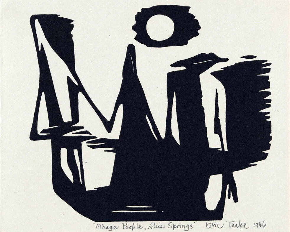


In the early 1980s with a global return to painting and the dominance of a neo-expressionist style, wood cuts also re-emerged, with a vengeance it might be said, when looking at the large wood cuts of George Baselitz from 1981 and 82 where the wood has be slashed with an electric grinder rather than a graver. Baselitz had been making wood cuts and wood engravings since the 1960s but came to international prominence in the 1980s with the global resurgence of expressionist painting and printmaking. German artists such as Baselitz and Anslem Kiefer [installation below is survey of Kiefer’s woodcuts at the Albertina, Vienna in 2016 site includes video on the woodcuts] were presented as recapturing the spirit of the early twentieth-century forms of German expressionism especially the woodcuts of the Die Brücke artists such as Erich Heckel (1883 - 1970), Emil Nolde (1867 - 1956), Karl Schmidt-Rottluff (1884 -1976) and the leader Ernst Ludwig Kirchner (1880 - 1938) who had linked his adoption of the woodcut back to the tradition of Durer. In much more recent times the woodcuts of Kirchner would also be evoked as one source for the contemporary woodcuts of German artists Gert & Uwe Tobias. The installation below is at the Saatchi Gallery in London in 2009.


While the return to expressionist painting brought renewed interest in the prints from the seventies of established painters such as Baselitz (born 1938) there was equal interest in America in the prints of Helen Frankenthaler who embraced the production of woodcuts in 1973. Most of the New York School of artists who made such an impact on the global interpretation of modern art after the second world war were primarily interested in painting. One exception was Helen Frankenthaler (1928 – 2011) and in the last few decades of her long career put enormous investment into making woodcuts, constantly experimenting with the medium, with scale, techniques and use of multiple blocks. The most recent exhibitions of Frankenthaler woodcuts:
Helen Frankenthaler: Radical Beauty (Sept 2021 – April 2022) Dulwich Picture Gallery, London
Helen Frankenthaler – Woodcuts: Prints and Proofs in Norway in 2019
No Rules: Helen Frankenthaler Woodcuts, The Clark Art Institute Williamstown, MA 2017
The National Gallery of Australia, in Canberra holds a comprehensive collection of Frankenthaler’s prints. These are available on the website for the 2006 exhibition.
Against the grain : the woodcuts of Helen Frankenthaler NGA 2006
All the prints in that show were drawn from the Kenneth Tyler Collection of prints which is an excellent resource for late twentieth-century American prints.
The NGA portal on the Tyler Collection also has a listing of the catalogues and essays related to the artists from American, and elsewhere, who printed with Ken Tyler.

Helen Frankenthaler (1928 – 2011) Madame Butterfly 2000 relief colour woodcut printed from 46 woodblocks on three sheets of paper c 106 x 201.9 cm

Helen Frankenthaler (1928 – 2011) Freefall, 1992-93 colour woodcut and stencil on white, handmade TGL paper base sheet hand-coloured with dye using plexiglass and Mylar stencils; woodcut printing from one assembled plate consisting of 21 woodblocks; one ink applied using stencil after printing. Paper pulp dyed in 15 colours from 13 plexiglass and five Mylar stencils, printed from one plate assembled from 21 Philippine Ribbon mahogany plywood blocks. 199.4 x 153.2 cm (sheet) See this Phillips Auction site for images of Frankenthaler and Ken Tyler printing this work.
BACK TO THE BEGINNING AGAIN : PRINTS BY FIRST NATIONS ARTISTS FROM AUSTRALIA AND THE TORRES STRAIT
Australian First Nations artists have inherited one of the oldest living cultures on earth and at least 20,000 years ago Indigenous Australian artists were engraving symbols on rock and wood. It shouldn’t be a surprise that young, and not so young Indigenous artists turned to woodcut and linocut for a medium to translate ancient symbolic vocabularies. The Australian Indigenous painting movement had been in full swing for several decades when the print movement began in the eighties with the general re-embrace of print as an expressive medium, but it took hold in the late 1990s when technical colleges started to take in Indigenous students from the remote areas that had not benefited from the art centers that were established in the seventies and eighties. Most print mediums were adopted but the Torres Strait artists favoured linocuts. Relatively soon after the Torres Strait Printmaking movement began, one of the artists involved, Brian Robinson, presented a paper on its origins at The Fourth Australian Print Symposium, National Gallery of Australia, Canberra in 2001 and this is published on the National Gallery Australian Prints + Printmaking resource site.


![Dennis Nona [ Waiben and Badu Islands, Torres Strait] (1992-) Thabara 1992 linocut colour applied à la poupée 52 x 67.1cm](https://images.squarespace-cdn.com/content/v1/5d0a492836336000012bc86d/1631799072806-OUL3TTL6PB9BNIE8O7ZS/1993.348_002.jpg)


It is interesting that the classic Torres Strait Islands style of linocutting favours a dominance of white line cutting which contrasts with selected areas of black which inevitably make up the figurative motifs. This might suggest some linkage to the early wood engravings of the Bewick school, but that linkage is coincidental, as the style of these works was culturally predetermined to a large degree. This is not to say this style of linoleum cutting will not evolve or change and that process is already evident in the examples from the past twenty years. It may even be possible in several decades, if not already, to periodize these works as many art historians still love to do. The status of wood engraving in the nineteenth century was always contested because of the instrumental demands it served and the craft of cutting wood did transition into the twentieth century to be considered as a purely aesthetic medium but it was the humble linoleum cut that became the primary relief medium for printmakers in the twentieth century. And how versatile it proved. Good and great prints are timeless but that doesn’t mean that they can’t be dated by style, intent and subject. All discussion above on the technique of block cutting has been focused on how the surface of the block is addressed, attacked, cut, graved, punctured or scraped, by whatever means, to coax an image from the block. The means and method of cutting plays no small part in how an image works on the viewer and the nineteenth century history of wood engraving demonstrates how significant the index of that cutting was. As demonstrated earlier the expressive cutting or graving of lines in the wood activated photography as a medium and facilitated its rise to be the primary image to carry mimetic content. And, at a fundamental level, nothing changed in the twentieth century so far as the expressive cutting of wood or linoleum was concerned. The next linocut here by Noel Counihan (1913 - 1986) is less controlled in the way the image is cut compared to say, a Brian Robinson linocut, but this is in the cause of the expressive intention of the artist. The Janet Dawson is even more uncontrolled, seemingly cut with a Dremel or small drill. It doesn’t go too far to say that the cutting is the expressive content that makes the print.

Janet Dawson (1935-) (untitled) 1993 linocut 14.9 x 15.2 cm

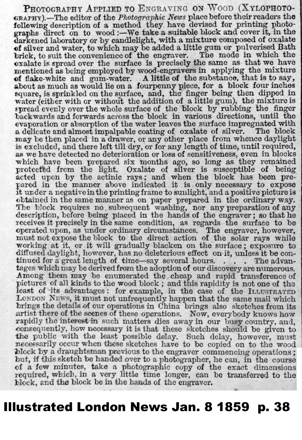
Noel Counihan (1913 – 1986) Albert Namatjira (from 'Linocuts Counihan '59' portfolio) 1959 linocut 60.9 x 30.5cm